The world is full of nitty gritty details, recognising and appreciating these help form great experiences. Let that be appreciating the sound of birds on rainy mornings, or something as mundane as the little notification sounds your phone makes when your food is just about to arrive.
As designers, it can be an overwhelming task to figure out how to improve the user's experience (that’s what they claim this whole shindig is about anyways). A well-designed filter, a smooth animation, or even a cool button is designed to aid the user and make their experience more memorable. Being able to take away an ounce of inspiration and find a way to translate it into the products we build allows us to grow and shape the world around us.
What is good product design?
Good digital product design is a key goal for any designer looking to create physical or digital products. It’s the process of developing new products by integrating user experience, visuals, and other essential digital attributes. In simpler terms, it’s about creating a product that people want to use and gets the job done.
A good digital product designer will think about how users will interact with their creations from start to finish. They’ll also think about how they can make it as intuitive as possible while still being aesthetically pleasing and representative of the brand. Good product design is a combination of the emotional, functional, and artful dimensions.
• Answering questions like, what emotional response does my product invoke in my user helps understand the emotional dimension of product design.
• The functional experience seeks to answer the basic question; what basic functional need does this product serve? What is the core purpose of this product?
• As humans, we are attracted to beautiful experiences. One way of ensuring a great user experience is by making sure your product is artful and appeals to the user aesthetically.
Borrowing inspiration is nothing but the ability to keep your eyes and ears open along your journey as a designer. A great way to get started; is to always be on the hunt. When it comes to digital product design examples, there are countless innovative and inspiring creations to draw inspiration from. From sleek and modern tech gadgets to user-friendly mobile applications, the world of digital product design offers a wide range of examples to explore. Whether you're looking for ideas for your own design projects or simply appreciate the artistry of well-designed digital products, there's no shortage of examples to spark your creativity. Take a look at some of the most iconic digital product designs to see how form, function, and aesthetics come together to create truly remarkable pieces.
01. Spotify
Let’s get started with the all-time favorite; Spotify. For those of you who are living under a rock, Spotify is a music streaming app with over 61 million users. It is one of the best examples of great design out there. Period.
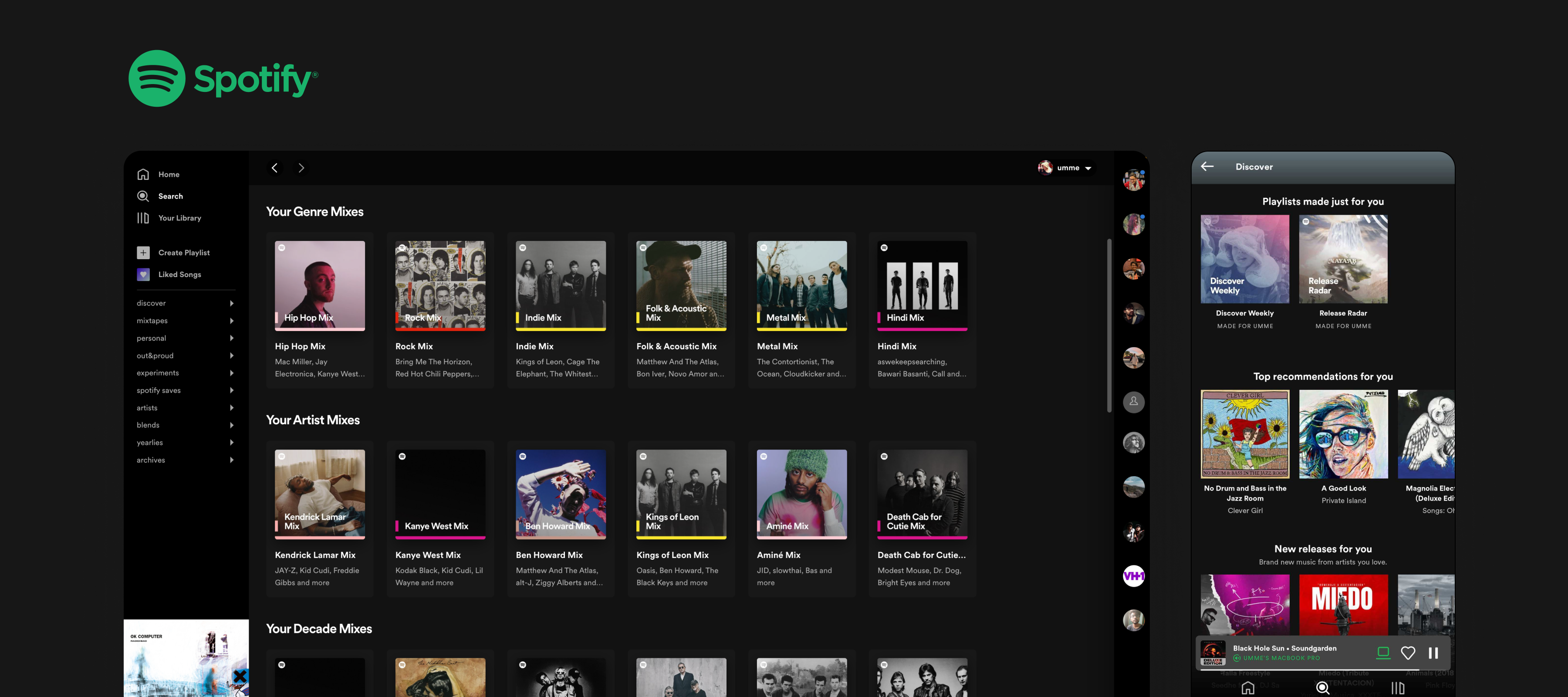
✨ Key feature
Made for you - Personalisation is something Spotify has completely nailed down. They believe in the opposite of a “one-size-fits-all” experience and one of their core design principles is to stay ‘relevant’. They have found the right ability to show the user exactly what they want when they need it and in the right context.
This human connection makes the user feel valued and brings about a feeling of belonging. Playing on these emotional strings, keeps the user returning to Spotify as compared to their competitors. The next time you’re putting together a product, ask yourself, what value does this product bring to my user that will keep them returning and how can I make the most of it?
📎 Spotify also continuously experiments with its very clean and sleek-looking UI. To go in-depth into Spotify's design process and decisions, check out spotify.design.
P.S: Spotify, if you’re listening; can you please make the search bar in my ‘Liked Songs’ sticky when I scroll? Thank you.
02. Uber
Uber’s design system, Base, is one of the cleanest, most efficient, and extensively customizable design systems out there. Base allows Uber to build on great functional and visual consistency. Functional consistency allows a user to predict how certain elements will behave which gives them more freedom to interact with the product whereas visual consistency helps users cognitively classify UI elements. The use of this system in combination with its immaculate design language makes Uber a great source of UI and UX inspiration.

✨ Key feature
🏃🏼 49% of users hold their phones with one hand specifically while they are on the go.
One-handed use - As a designer, we want to make our product as easy and comfortable to use as possible. Most of Uber's users are looking to book cabs in a hurry while getting from one place to another or while they’re running late. Playing on this, Uber's entire app is designed to be used by just one hand.
Users shouldn't have to struggle to reach important parts of the app; like the menu or main CTAs. Understanding the user's mindset and strategically placing the right features in the right places is essential to great product design. Concepts like progressive disclosure, flyout menus, and gestures all aid in designing for better one-handed use.
03. Airbnb
Airbnb allows users to rent out their homes/hotels to people who are looking for accommodation in specific locales. Airbnb revolves around building trust and designing for everyone. They dedicate a lot of time, money, and research to conducting user research and using data scientists to help them decipher their learnings.

✨ Key feature
Advanced search - At the heart of Airbnb is its flexible search options. This carefully regulated search option can amaze users across their journey and show them just what they’re looking for. Moreover, the addition of their ‘I’m flexible’ feature has changed the way users now think about travel. Inculcating these complex features into the product while still keeping the UI and user flows easy and clutter-free is central to Airbnbs success as a great product.
Remember to keep it simple. Understand why your user is here and how they’re going to maneuver their way through your product. If the user journey is more open-ended and complicated, keep your UI simple. The use of white space, legible fonts, and straightforward navigation is the greatest gift you could give your users.
04. Nike Run Club
Nike, overall, is one of the cleanest, smoothest products to use out there. Right from their shoes to their apps and websites, they deliver the ultimate feeling of grandiosity in the simplest possible way; by the correct use of white space. One of their apps, Nike Run Club allows you to track runs, challenge friends and stay motivated while you go on your fitness journey.
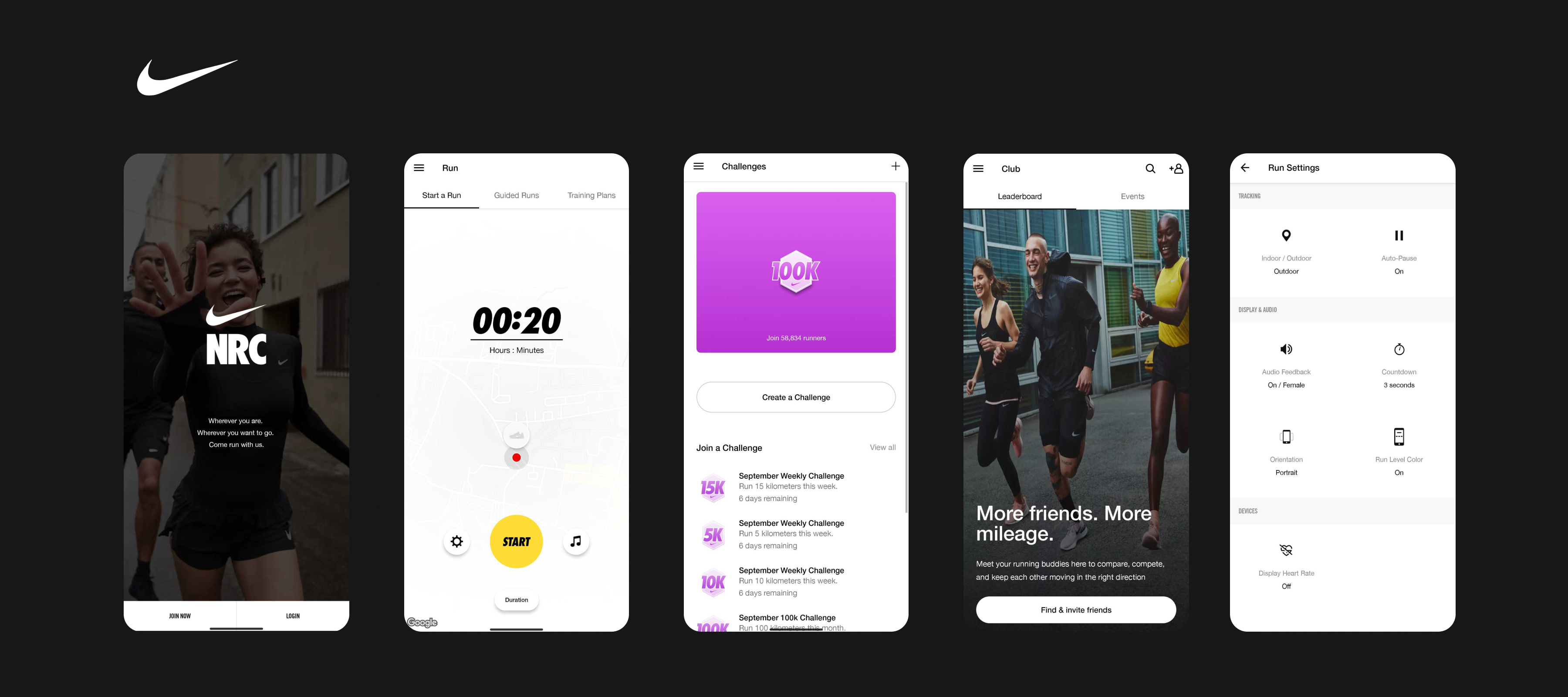
✨ Key feature
User engagement - The Nike Run Club app allows its users to enter their goals and encourages them to get there. While they’re not the only ones to do it, they make smart use of gamification to keep their users committed and eager to come back. They celebrate progress using personalized messages; this touch of continuous encouragement boosts users’ confidence which in turn raises engagement in the app.
As designers, we’re constantly on the lookout to provide more than just a great experience to our users, we want our product to better their lives in unimaginable ways. Nike Run Club is a great example of how great product design helps people become better versions of themselves, not just better users.
05. Medium
Medium is an open writing platform where writers can write, publish and promote their stories to a huge audience. A clean white background with minimal clutter allows the user to focus on reading or writing while using the platform. Medium has been through many makeovers through the years and is always looking to optimize its reading/writing experience.

✨ Key feature
Polite design - The concept of polite design revolves around designing products to behave like a likeable person. Some key points are to be considerate of your user's time, be perceptive of their situation and anticipate their needs. While reading, users are usually concentrating quite hard. Medium does a great job of gracefully and tactfully nudging users for their attention by using subtle UI and notifications; for example to renew their subscription.
As the user's engagement with a product gets deeper and more layered, as designers it should be our goal to start considering them as social interactions. We need to bring a feeling of trust around by sharing control and respecting the user's choices and decisions. Start asking your users, “Hey, I am going to do this now, is this okay with you?” is a good way to get started. People tend to respond positively when the product experience is subtle and respectful of their attention.
06. Stripe
Whenever I’m stuck designing a product, I immediately open Stripe and begin hunting. For a website that does something as complicated (and boring) as offering payment APIs, Stripe does a pretty good job of flaunting it. Great copy, smooth animations, and elegant UI leave one inspired.
Additionally, if you’re on the hunt for dashboard design inspiration, Stripe has a great one. While being able to use almost all the real estate on your screen, their dashboards are clean, easy to navigate through, and consistent.
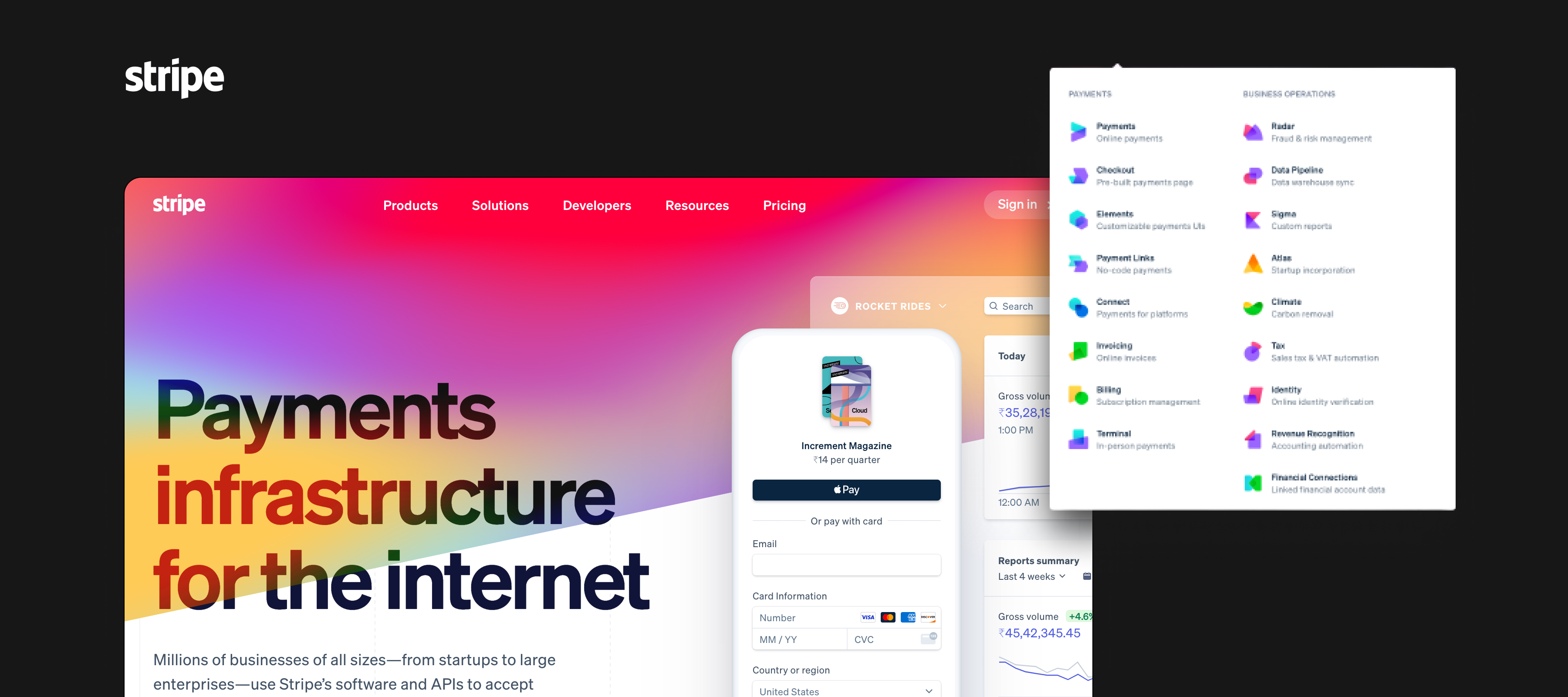
✨ Key feature
Seamless navigation - Even though there are over a dozen pages on their website, one can always find their way around Stripe through their well-designed navigation. All menu items are well-categorized with unique icons and color schemes. This encourages users to spend more time on the website and explore. Moreover, it helps them find the information they are looking for quickly and without any obstacles.
Easing the user's ability to use your product is the core principle of being a designer. One of the best and most basic ways of doing this is by allowing them to explore their options and find just what they’re looking for. Spend some time building IA diagrams and mapping out user flows to give your user the experience they are looking for.
Enjoying this article? Don't miss out on more exclusive insights and real-life digital product stories at LeadReads. Read by Top C Execs.
Join here.
07. Figma
What do all the best product designs mentioned here have in common? They all use the same design tool — Figma. Figma is utilized widely not only by designers but also by those who are not designers, defying the limitations of its total addressable market. Figma came in 2016, and its growth has been exponential, stealing away the users of its competitors.
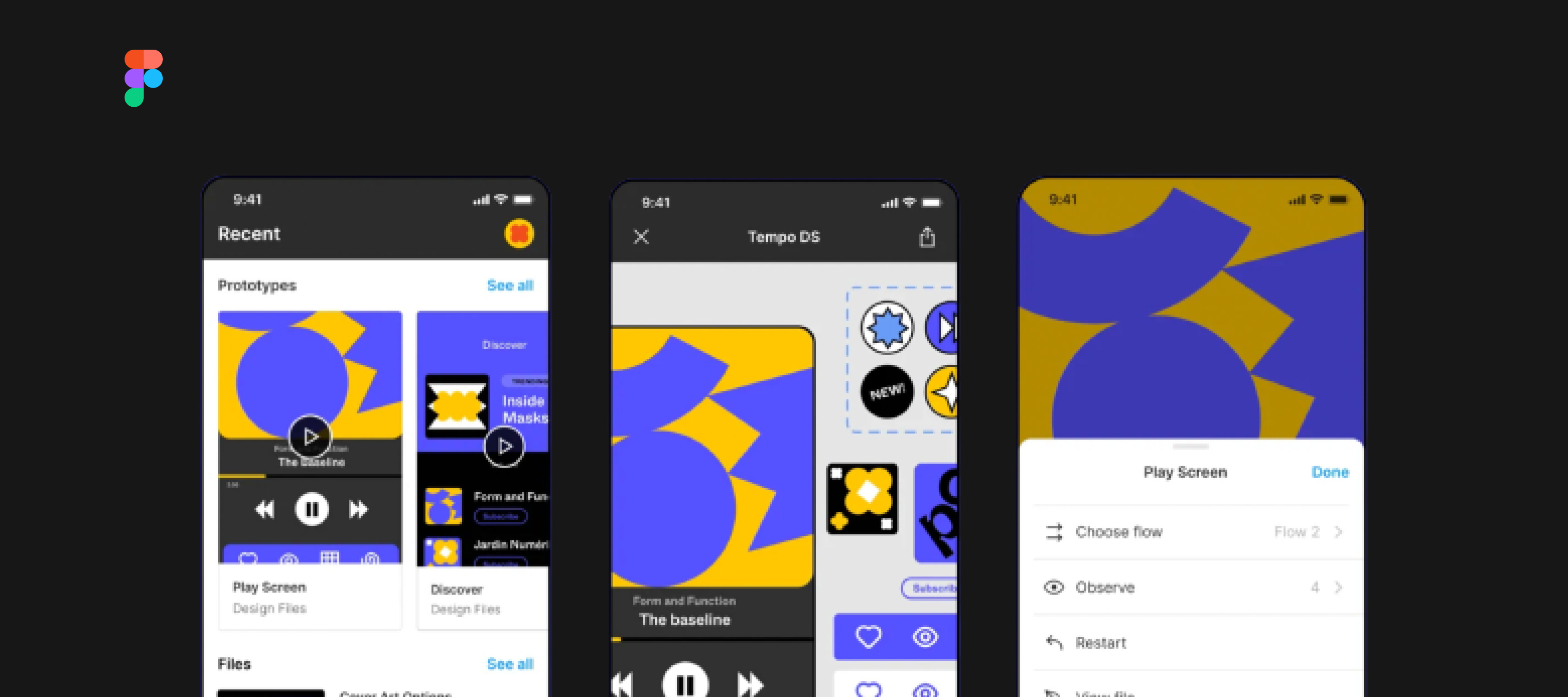
✨ Key feature
Browser-based - Figma was the first design tool that could be used without having to download RAM-destructive tools. Since the design could be done on the cloud, teams could collaborate on projects, keep track of revision history, share design libraries, and get input from various stakeholders in one location. This significantly improved the way teams collaborated, making it all in real-time.
Figma conducted research to find out the unique value proposition that would differentiate it from its competitors. Every time you design a product, look for the unique value that your product will provide that will give you an edge over your competitors.
We, at Wednesday, have a team of experts well-versed with Figma. We even wrote an article that goes deep into their latest product update. If you need to talk to a team of designers to help with your product design, feel free to book a call with us.
08. Notion
An all-in-one workspace that allows you to take notes, manage projects and store important information. Notion helps users keep all aspects of their life synchronized, moreover, the platform seems to satisfy a user's need to feel organized satisfyingly. Notion is a great inspiration for design; from complex sorting options to the hierarchical way, information is displayed on any page.
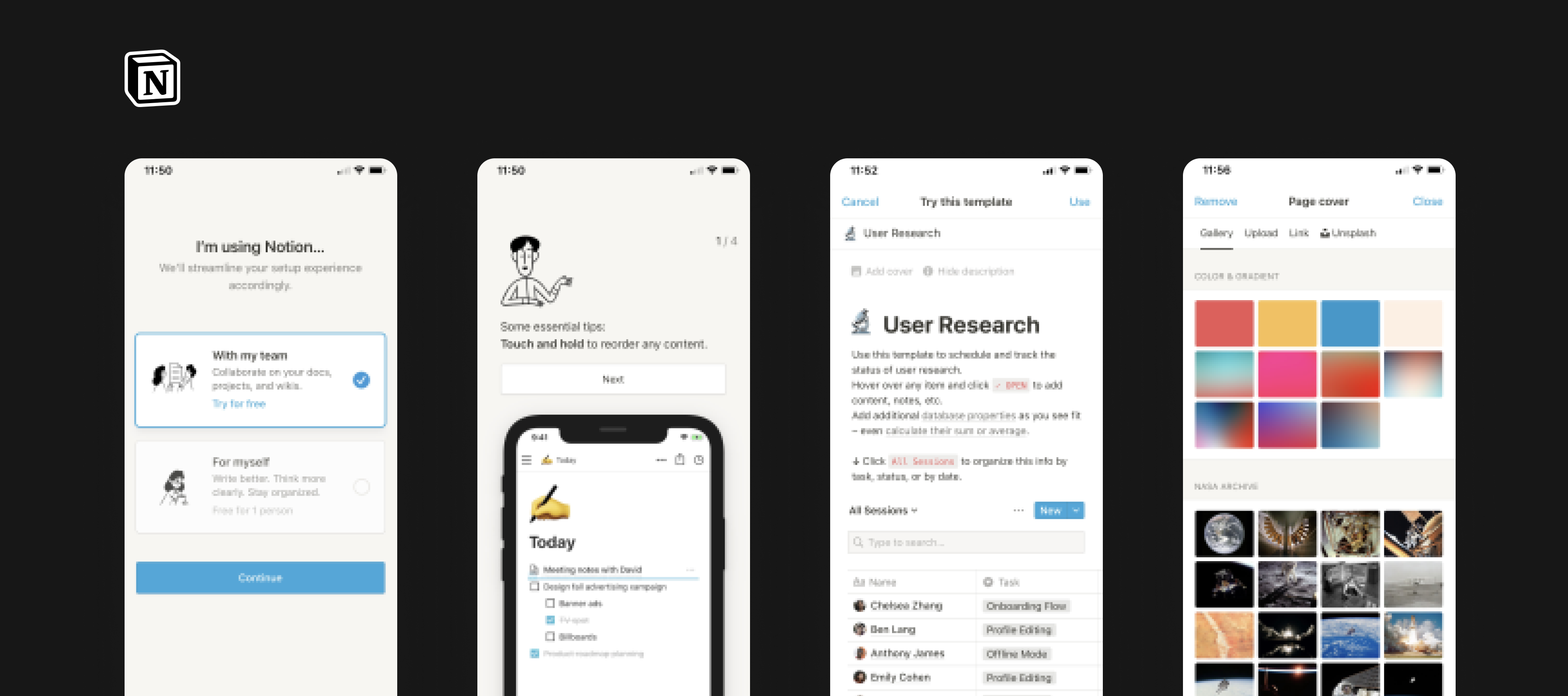
✨ Key feature
Highly customizable - Notion caters to a wide range of audiences, from people who just want to use it to take minutes of the meeting to users who are planning out detailed project roadmaps. This ability for the user to control how personalized of an experience they are looking for attracts users and helps them adapt to the product.
Everyone wants to see the world in their own way. Customization allows users to select what they want to see and how they want to see it. It enhances user experience as it gives the users the ability to control their interactions and make the product their own. It increases their happiness and drives customer loyalty. Try to take time out to think about what sort of controls can you leave in the hands of your users that would drive their satisfaction.
09. Google Pay
When Google Pay launched in India, first under the name Tez, it was all the hype! The concept of being able to send money instantly via your phone in less than 5 minutes was mind-boggling. To reach a vast audience and generate hype, Google Pay had to come off as one of a kind. They also added a level of gamification to reward users and generate exposure through word of mouth.
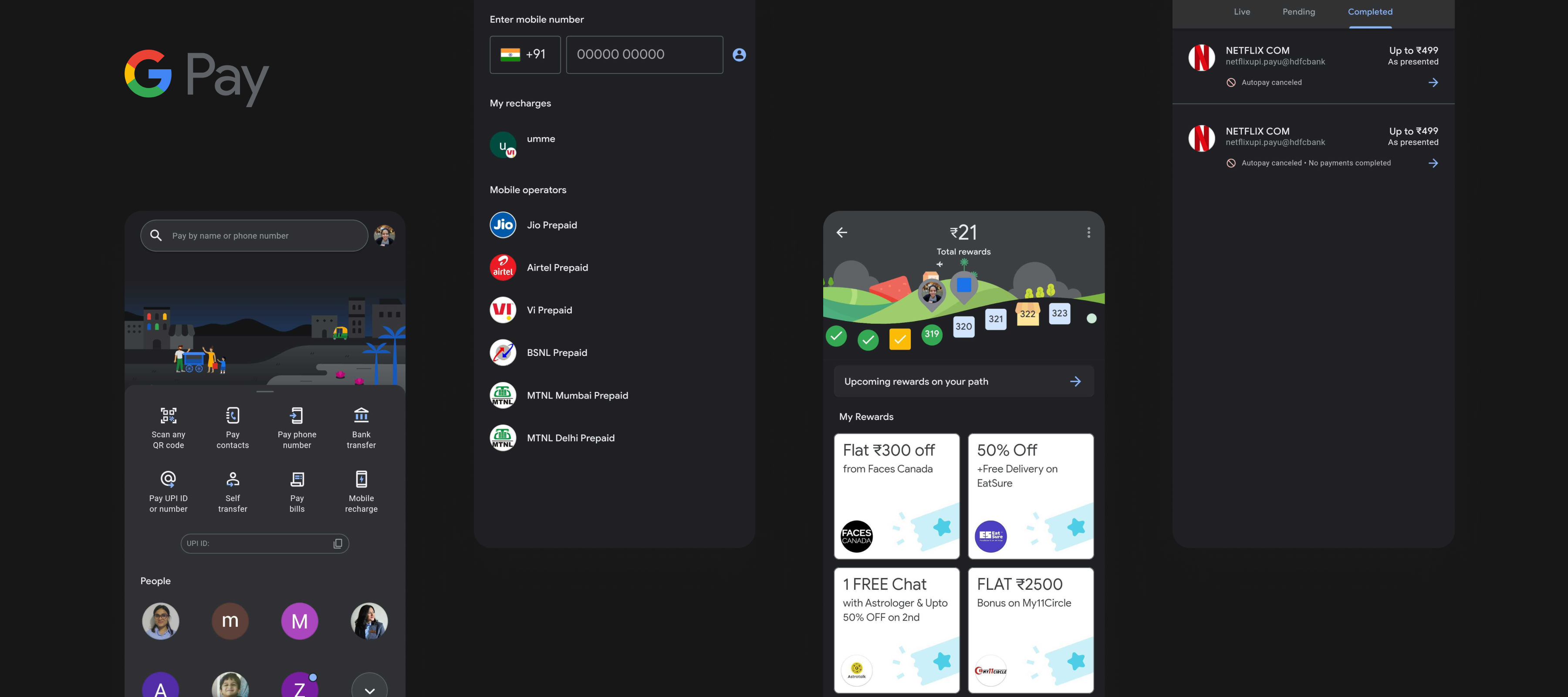
✨ Key feature
Made for everyone - Google Pay has the innate ability to be easily understood and used by almost anyone! It is simple to use, doesn’t require any technical knowledge, and caters to all age groups and social classes. Google Pay is used throughout India from vegetable sellers to educational institutes and even banks! They achieve this through a beautiful, sleek design language, that displays the futuristic abilities of the product.
Designing for all users is any designer's biggest duty. Products like Google Pay, which are potentially used by almost every individual, must be designed and structured in a way that is understandable and easy to use for everyone, with no exceptions. To design great digital products, a user must be able to complete their goals easily without encountering difficulties or frustrations. It’s that simple.
10. Netflix
Does this product even need an introduction? No matter who you are, where you’re from, or what you do; you have used or heard of Netflix. In the world of digital media, gone are the days of banging your set-top box, now it’s all about “Netflix and chill”. In a sea of competition, Netflix seems to be the clear winner in creating an all-around immersive experience that leaves the user utterly satisfied with their viewing experience.

✨ Key feature
Keeping it interesting - Netflix churns out millions of data sets every day to display to users at the end of their long, tiring, mundane days. Even though the broader data set is the same TV shows or movies being rotated throughout the platform, it is how they display this information that keeps the users entertained. They use smart copy and distinctive categorization to appeal to different users. They also change up their artwork based on the user's preferences and display what would be the most persuasive to you.
Humans tend to get bored easily. In a world where digital products are being churned out in the millions, the key to standing out is by keeping your user immersed. The next time you’re stuck in your design process, wondering what that edge is; ask yourself how do I keep my user interested? How do I give them the most satisfactory experience?
11. Slack
For most users, Slack is quite easy to figure out. You get messages, and you reply to them, just like any chatbot. Fit this concept into a digital workspace, with the ability to react with emojis, perform advanced searching using modifiers, and pick a theme that suits you best, you’ve got one of the best digital products out there!

✨ Key feature
Going above and beyond - Slack has nailed down the regular asynchronous communication bit down. More than that, they provide features that aid the user's day and their communications in unimaginable ways. But they don’t stop there, they’re always looking for ways to go an extra step. With the addition of their shared channels across workspaces, you can now communicate externally and completely eradicate the need for emails, WhatsApp groups, and the such. How can a user complain then?
Never stop imagining what you could do for your user as a designer. It is in our blood to better the user experience to a level that the user would feel empty without us. Push yourself above and beyond to add that extra touch to your product and know that it can never be complete or perfect. Whether it is adding more options for customization or a better notification sound, you can always do better and Slack is a great source of inspiration for that.
12. Duolingo
There’s so much to learn from Duolingo, the global language learning app that made learning fun and addictive! Pick a language and begin learning. Just like that. Duolingo's three main goals are to help people learn, to grow by increasing the number of people who use it, and in turn generate money to support their cause for free, accessible education.
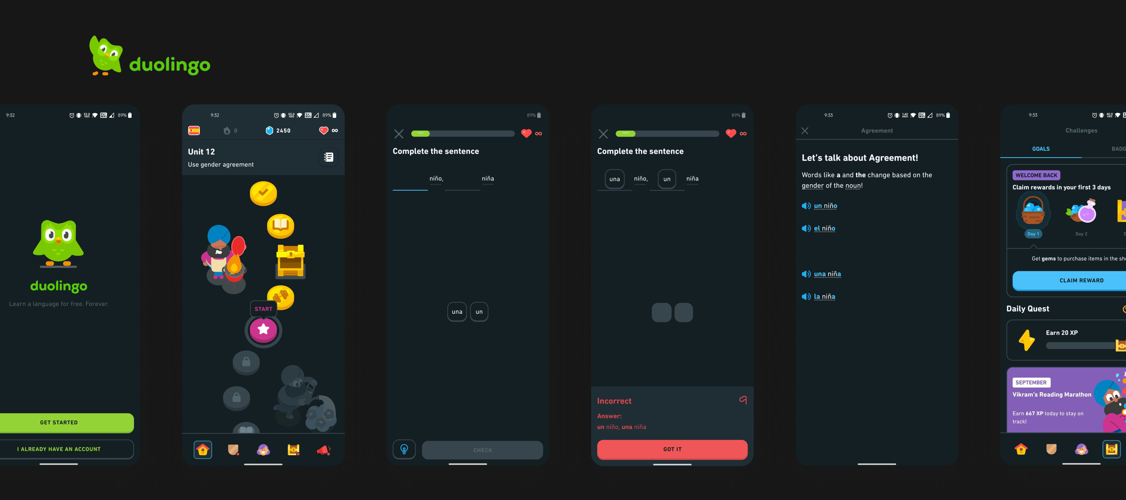
✨ Key feature
Minimal cognitive overload - For a product that is teaching you something as complex as a language, Duolingo has managed to make the information to show at any particular time easy to consume and digest. Courses are divided into tiny tiny chapters, that merely take minutes to finish and you can only move on if you complete the current chapter. This helps the user focus on the task at hand with their utmost attention and reduces cognitive overload.
User attention is your most precious resource as a designer. As time ticks, your user gets more and more distracted. Focusing on what to show your user, in what quantity and what best possible way is one of the best product design practices to follow. Minimize cognitive overload by reducing unnecessary visual clutter and by building on what users already know, like navigations are always on the top, so leave them there!
13. Headspace
In today's world, mindfulness has become a key buzzword. One such product that brought this concept to life in a great way is Headspace. Headspace is a meditation and mindfulness app that focuses on improving your mental health. Not only is it valuable to us as consumers but it is a great source of product design inspiration. At the core of Headspace, the main component is a voice clip. Most products use text or images but Headspace is built around short voice clips that demand the user's undivided attention.

✨ Key feature
Attention to detail - For a mindfulness app, the design language is key to attracting users and allowing them to feel safe and welcomed. Headspace has created a visual language that allows any user to feel related to it. They non-ambiguous characters of all shapes and sizes in different color combinations to create a warm, safe space that feels all-inclusive.
Headspace was able to pick on just the right aspects of the design language system and find its voice. As designers, we use visual language to communicate with our users. The fonts you choose, the colors, icons, and shapes all play a very important role in how users perceive your product. Spend some time and resources into really understanding your brand voice and shape and remember that every little curve and stroke counts!
14. CRED
CRED has been the latest craze in the Indian market for a while now. It is a members-only app that rewards users for paying their credit card bills. While many others tried, CRED was able to get the Indian market into a frenzy, with their out-of-the-box, edgy design language.
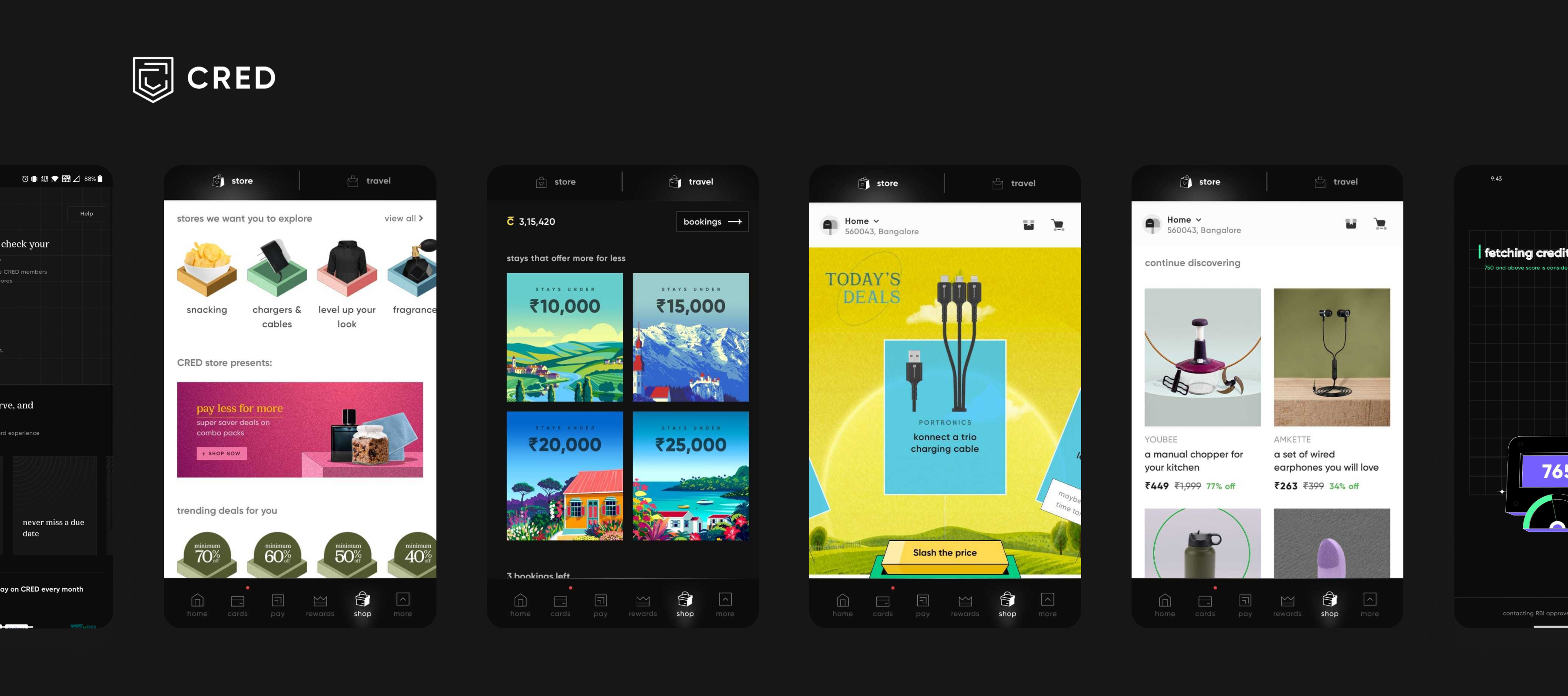
✨ Key feature
Aesthetics matter - Certain trends just seem to take over the design world one being, neumorphism; a different take on skeuomorphism. The Indian product market is mainly saturated with round-of-the-mill designs, using that to their advantage CRED was able to stand out from the rest and generate buzz. Overall, the app’s design is clean, minimalistic, and intuitive.
As designers, what we can learn from CRED is their confidence to experiment. They recently changed their entire design language again read more here. Spend 20 minutes in a day keeping yourself up to date with the latest design trends and when the time (or product) is right, use your design language and UI to make yourself shine from the rest.
15. Clue
Clue is a scientifically backed menstrual tracking app and resource for bettering your health. Although, not the first of its type Clue has become one of the most popular period tracking apps used by women over the world. With over 30 different tracking options, Clue uses simple yet descriptive icons to display the options and allows the user to customize them as per their will.
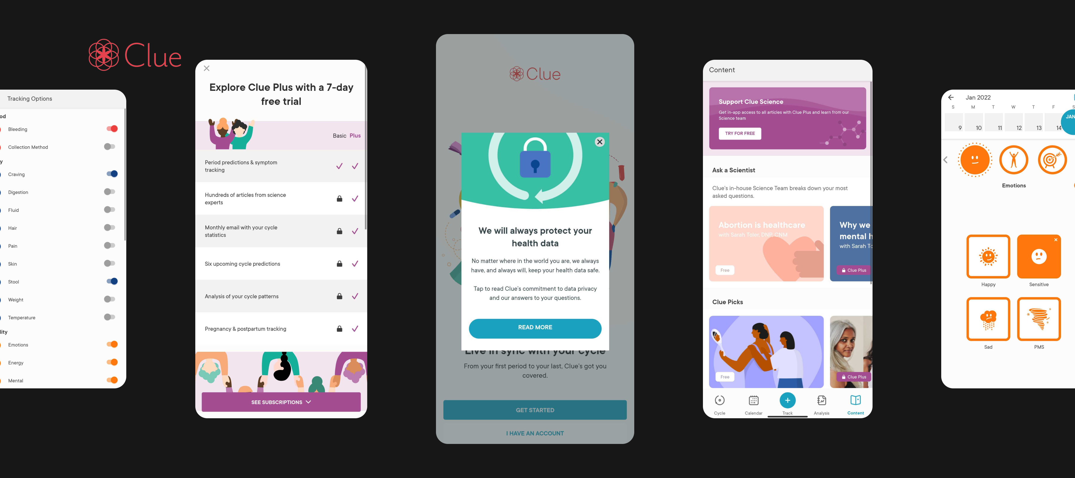
✨ Key feature
Emotional connect - With something as sensitive as period tracking, Clue does a great job at connecting with its users emotionally. They don’t use advertising and have a strict no-sell data policy, which reassures the user and helps them feel space. Moreover, they use the larger data set to explore topics in female health that could have a real-world impact. This helps the user feel like they are a part of something bigger.
Emotion matters. As designers we focus on designing for the user's needs but focusing on their responses is equally important. Emotional design invokes emotions and in turn, leads to positive user experiences. Every decision and consideration you make during your design process has the power to make your user feel something. Understanding your product's emotional value and designing with that in mind is key to good product design.
Take inspiration from everything
What does a branding agency do? The best ones take inspiration from everything around them. They train their mind to be able to sort through things and take in pieces of information that when put together create a masterpiece.
The next time you get a notification or you use a product with no primary CTA, take some time out and try to break down the value it serves the user.
There are millions of products out there, each with its unique design language and experience; whether bad or good. The products mentioned in this article are only some of the best out there. You can use these as inspiration for your next product design. We, at Wednesday, believe the key to successful product design is always thinking from the user's perspective and understanding their needs and pain points. If you’d like to talk more about product design or need help building your next product, book a call with us or drop an email.