


Like every craftsman, designers love their tools. Especially those tools that promise to stay up to date with upcoming needs. Figma dropped new updates during its Config ‘22, and the updates created a buzz around the design community for all the right reasons. We got 15+ big and small updates; some with slight learning curves. They are a good mix of ‘much needed’, ‘really wanted’, and ‘didn’t know we needed till we got it.
After using the new updates, here are my two cents on what I feel about them, and how you can use them to improve your design process. So without further ado let’s discuss some of the top favorites.
Dark Mode
As per a study, about 91.8% of users like to use dark mode in some form. So naturally, a dark mode was one of the most requested features amongst the Figma users.
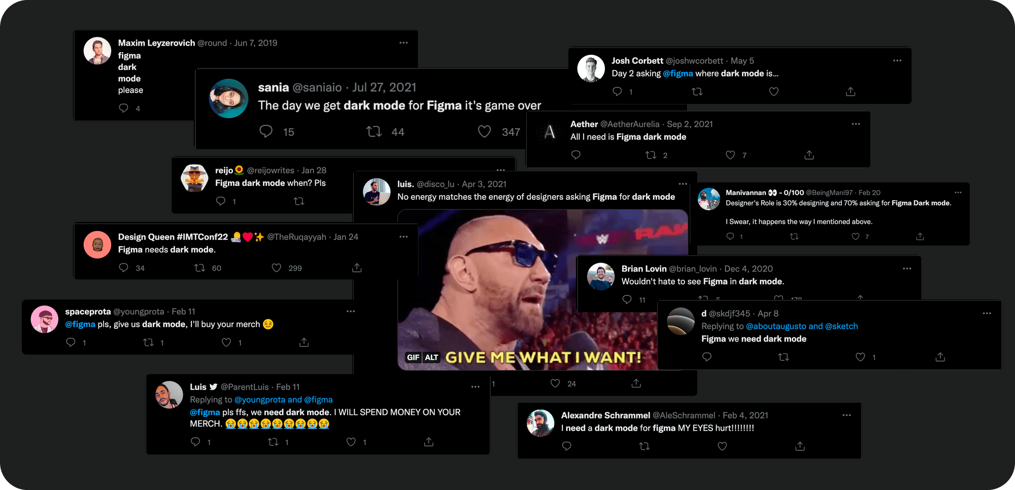
If you are a big dark mode enthusiast, the universe (read: internet) may have also presented some hacks to achieve the night view. However, with the new release, you can now add the dark theme by following these simple steps -
- Click in the top-left of the toolbar
- Go to Preferences > Theme.
- Select an option from the list of themes.
This feature also pushed a lot of plugin creators to build a dark mode for their plugins to fit seamlessly with Figma. Whether you prefer dark mode to reduce eye strain, improve battery life, or for aesthetic appeal, you know you got it.
Individual Strokes
We really love Figma's ability to design the way an element will be coded; breaking a barrier between developers and designers. However, lacking the option of individual strokes hampered this goal.
Moreover, using lines instead of borders added an extra element that needed to be accounted for during padding and auto-layout. Yes, every pixel matters.
Forgetting the past, we are just happy to be able to add custom strokes by the following steps -
- Select a layer, and add a stroke
- In the stroke section, click on the ‘Stroke per side’ icon on the bottom right
- From the dropdown, choose the side you want to add the stroke to
Auto Layout 2.0
Auto-layout is one of the features that sets Figma apart from other design tools. Being an avid user of auto-layout, having to break out of auto-layout, or nest multiple frames as a hack was (not to sound dramatic) heartbreaking. However, with the new update, auto-layout has now become even more versatile.
Negative spacing
With negative spacing, we can now stack elements using auto-layout. The most common use case is the ability to stack avatars, or cards. This can also come in handy for smooth prototyping using ‘smart animate’.


Absolute positioning
As a component evolves, the layout may not be as simple as having elements in a horizontal or vertical flow.
For example, to show an update on a card, we may add an indicator on the top corner. Theoretically, the indicator is not in a relative position to any of its sibling elements. Instead, it is relative to the parent element, i.e. the card.
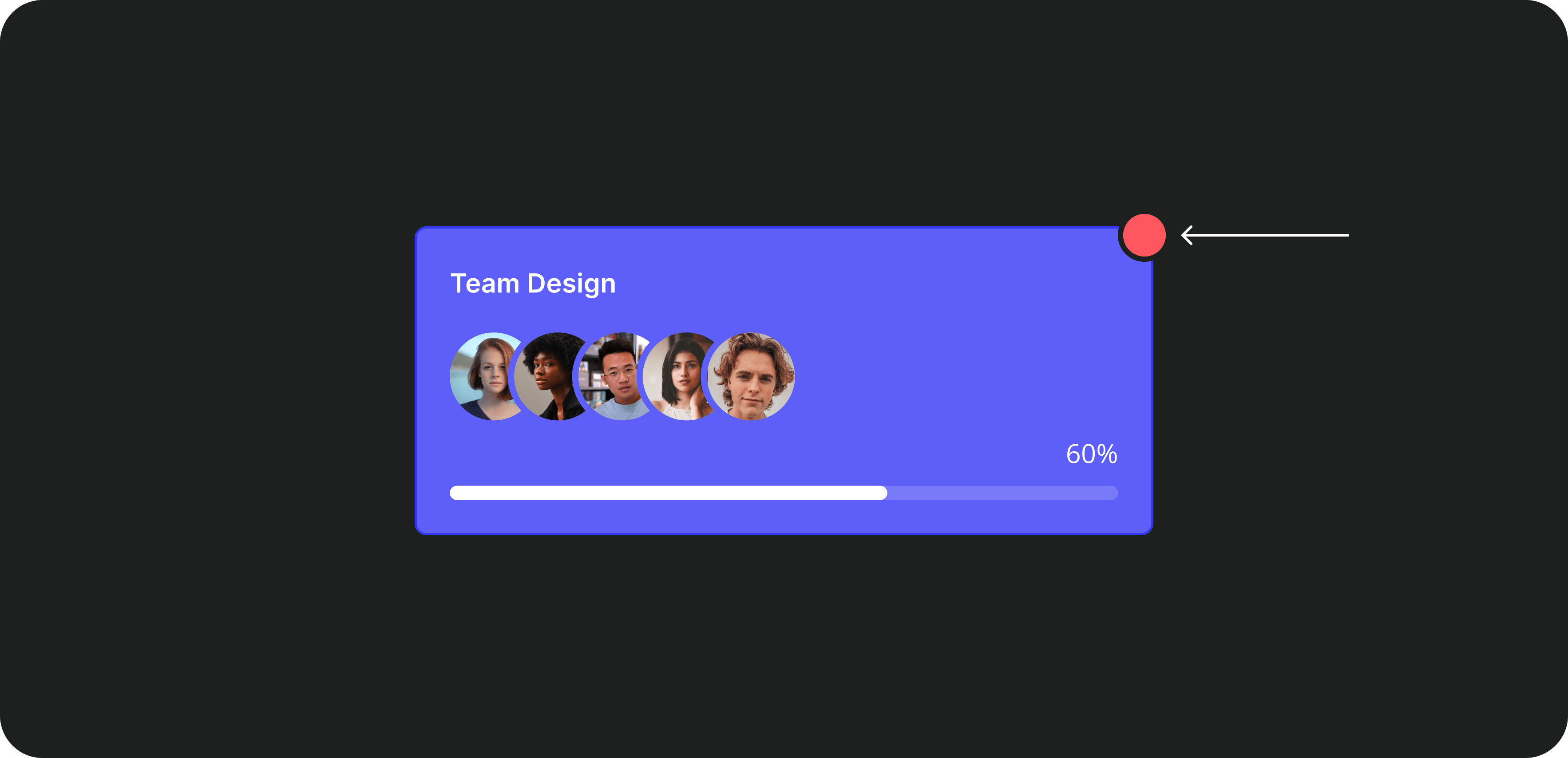
Until now, to achieve this, we would add another frame for the card and the indicator to be in. Now, by clicking the ‘Absolute Positioning’ icon on the top right corner of the left panel, we can set the element to absolute. This removes the element out of the auto-layout flow, while still being a child in the same frame.
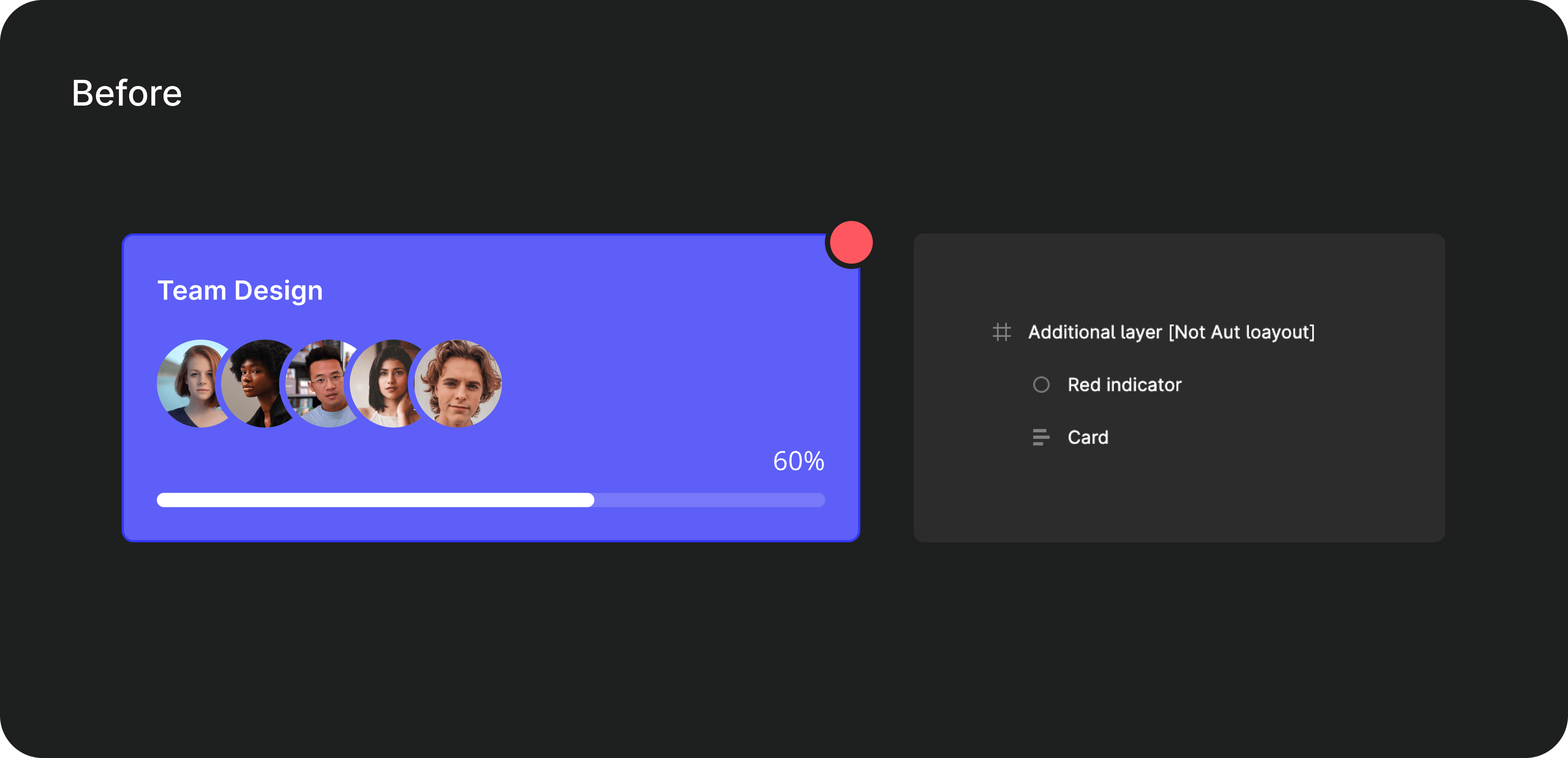
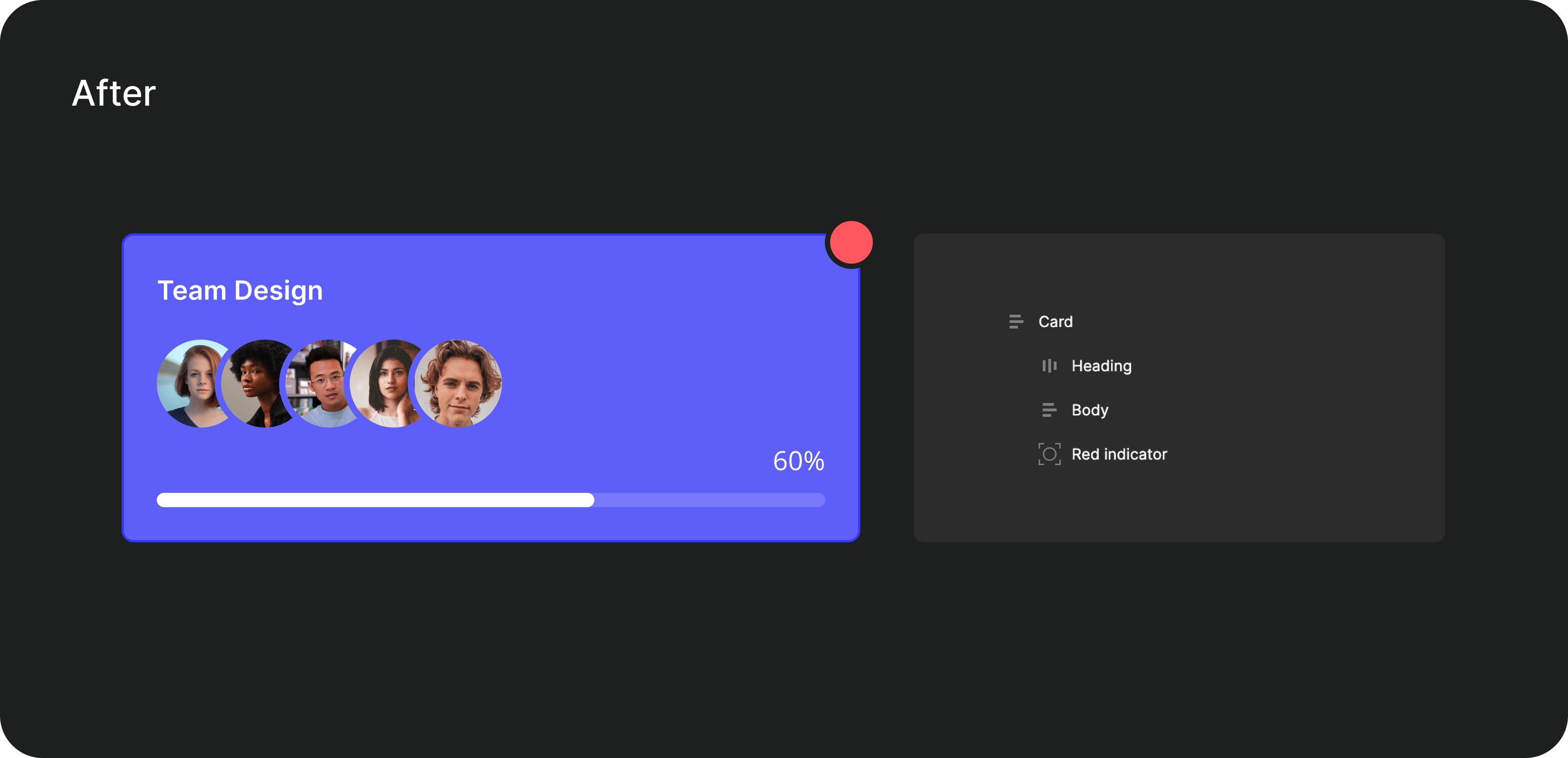
However, with great features, comes great responsibility. The absolute positioning may seem tempting in cases where we are short on time, or changing the auto-layout setting may be tedious. To make the most out of auto-layout, use absolute positioning only where it truly makes sense.
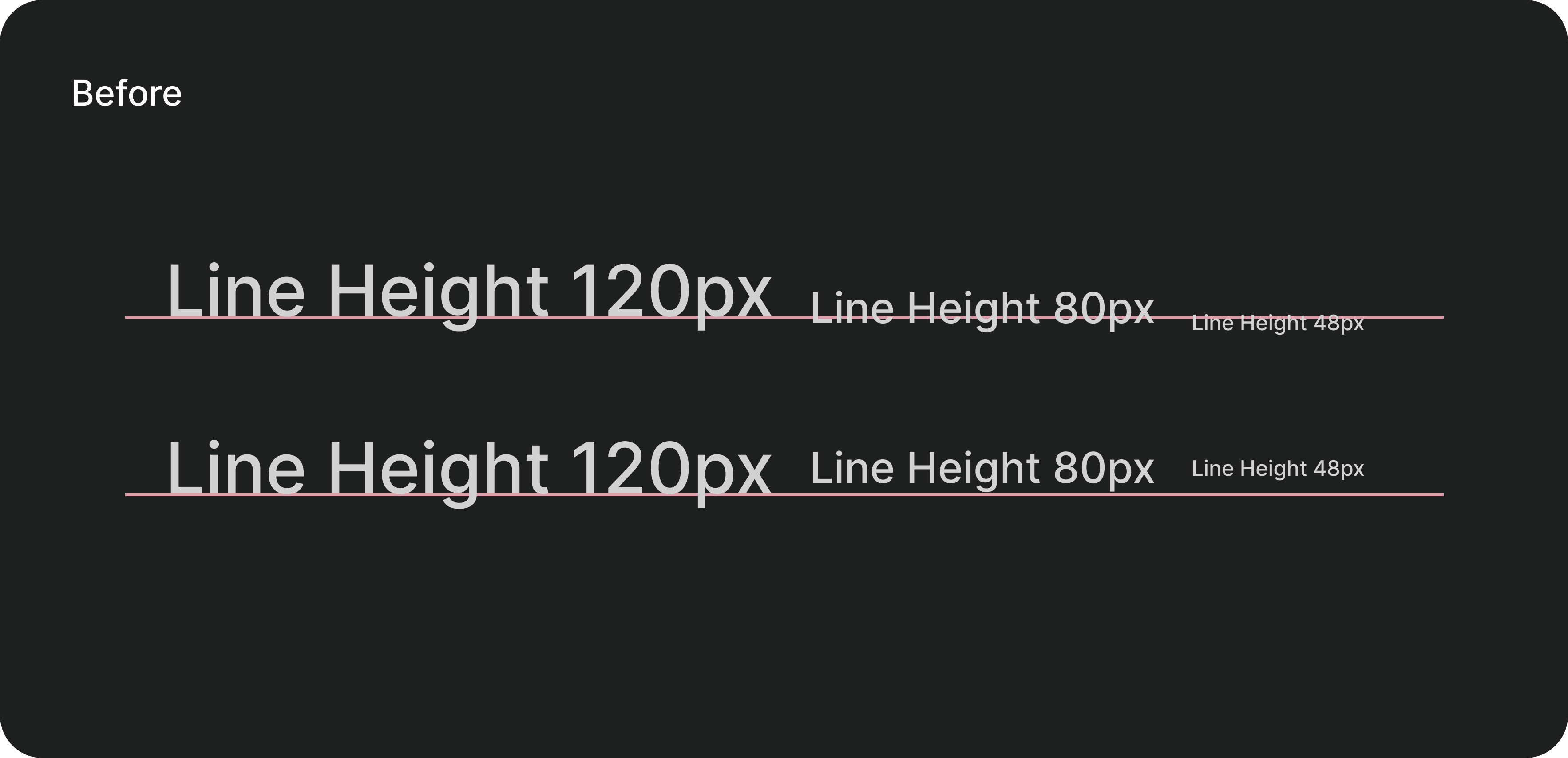
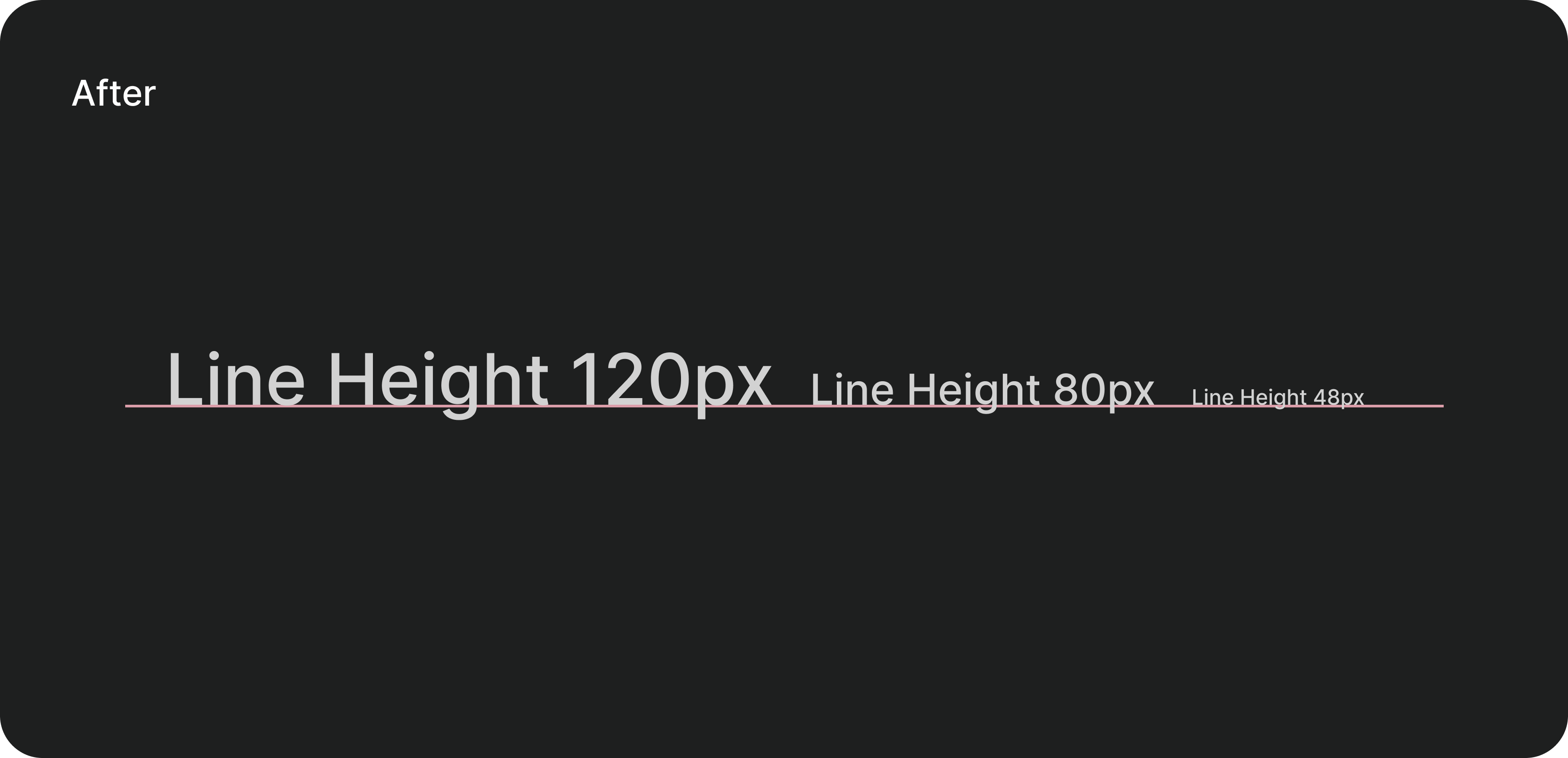
Text baseline alignments
This is your one-click for pixel-perfect alignment (in relation to text). Elements, sometimes when aligned horizontally with text, visually appear unaligned. This is because the whitespace of the line height is calculated as well. The line height is unaccounted for with text baseline alignment, and the elements are aligned with the text baseline.
Canvas control
Canvas controls are the new life savers! You can now select and hover over any frame on auto-layout and view the spacing size. With another simple click, you can make edits right then and there. These new features fall into the "didn't know I needed but omg thank you Figma" bucket; they save so much time!As designers, we like to trust our instincts. No longer are you restricted by setting numbers, simply drag, move and adjust to see what looks best and satisfies your design needs.

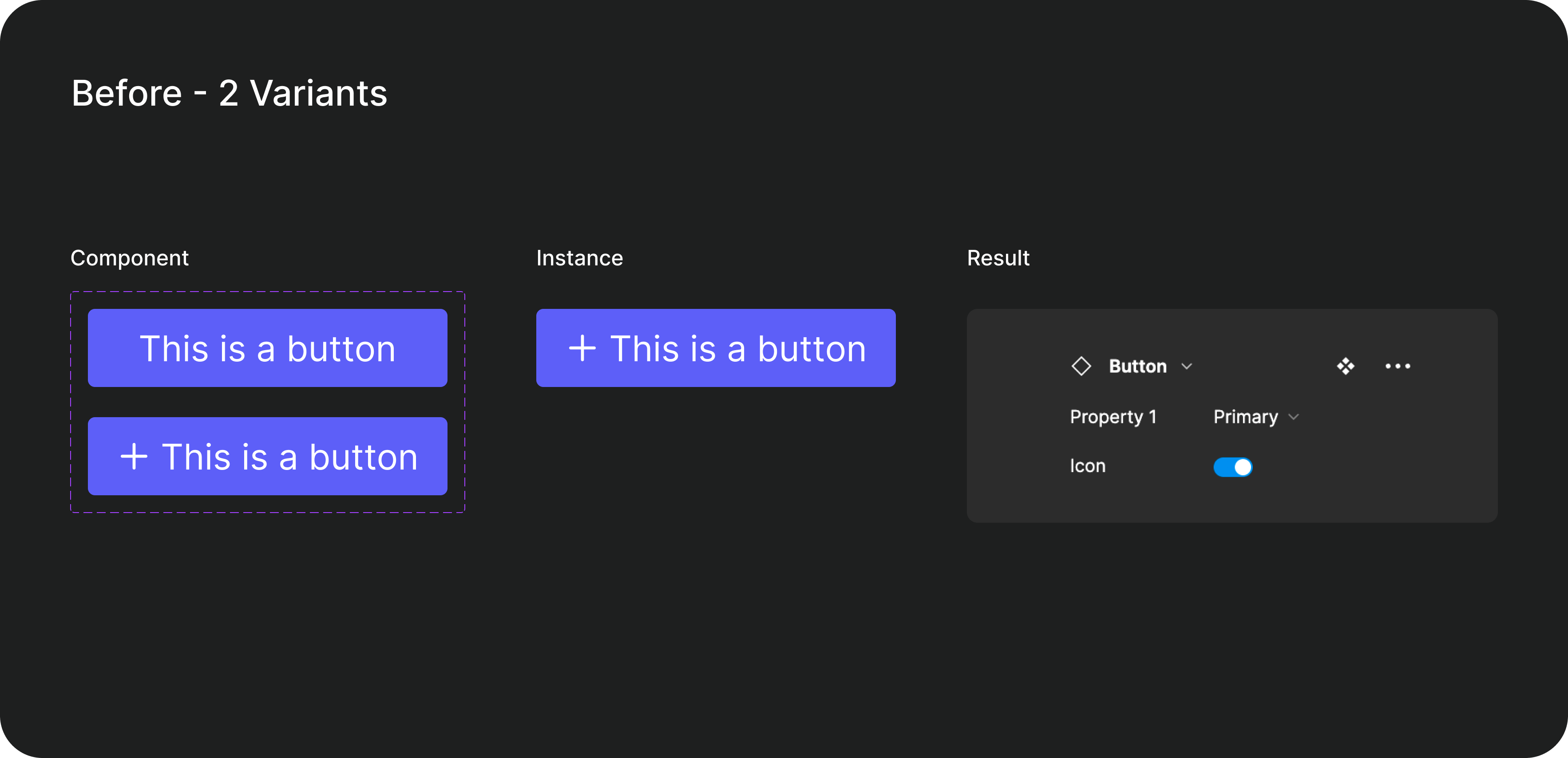
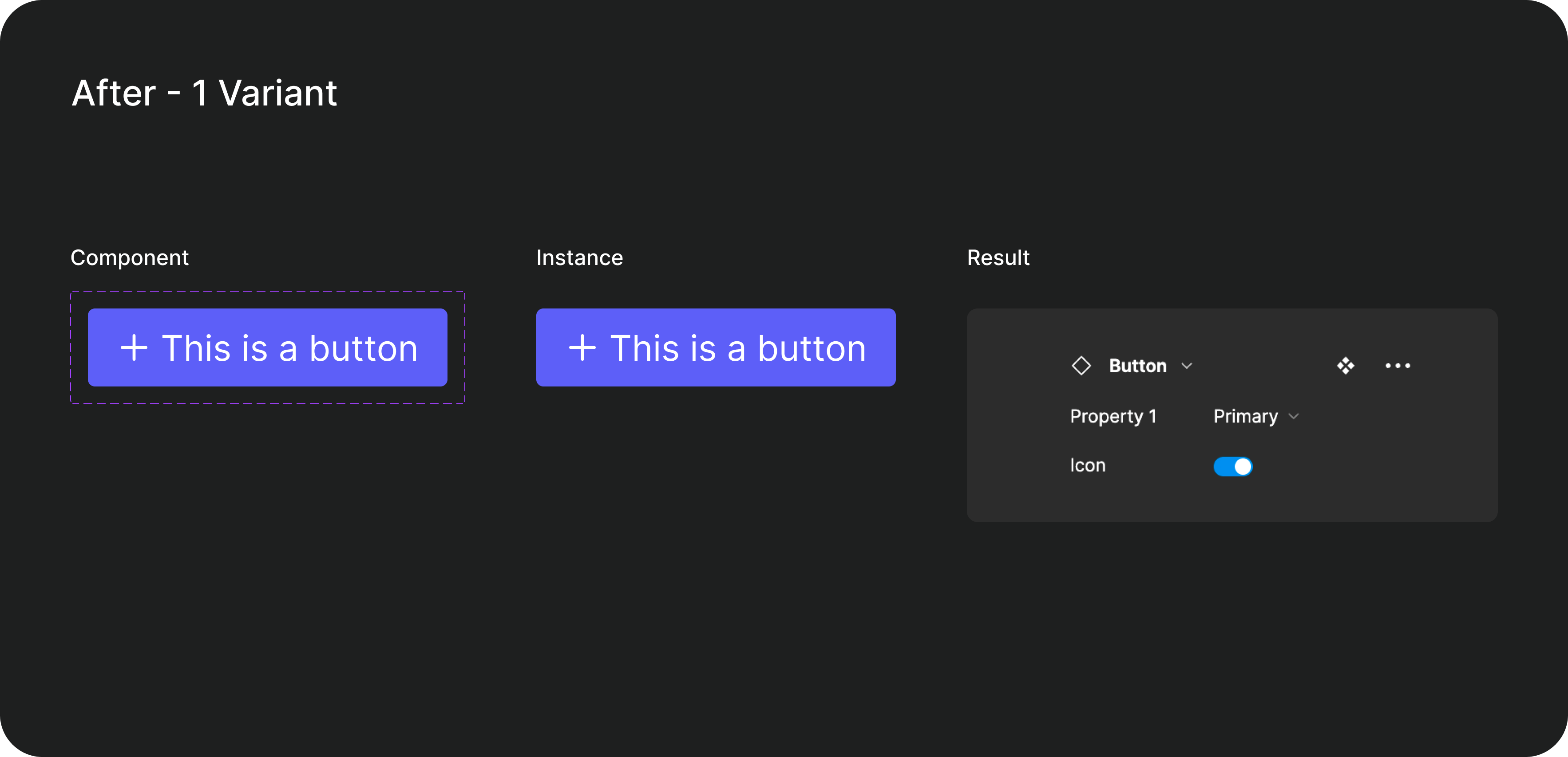
Components 2.0
Remember the amount of time we spent understanding the concept of ‘base components’? Yeah well, we don’t need those anymore. With the new component properties, Figma has simplified the way we create components, and how we add them to our design systems. The new properties introduced are
1. Boolean
This property lets you toggle the layer visibility. This is helpful in cases where the difference between two variants is just the addition of an element.
How to use it
- Select any layer inside the component
- In the right panel, click on the ‘Apply boolean property’ icon in the layer section
- Give the property a meaningful name.
- Set the default visibility as either ‘true’, or ‘false’
Where to use it
- The icons in the input box
- A status tag on a card
- A notification on the notification icon.
💡 Adding the prefix “Show” to the property name makes it easier for others to understand the purpose of the property
2. Instance Swap
Ability to change the instance of a nested component, without digging into the layers. However, to change the variant of the instance, you need to go into a layer deep.
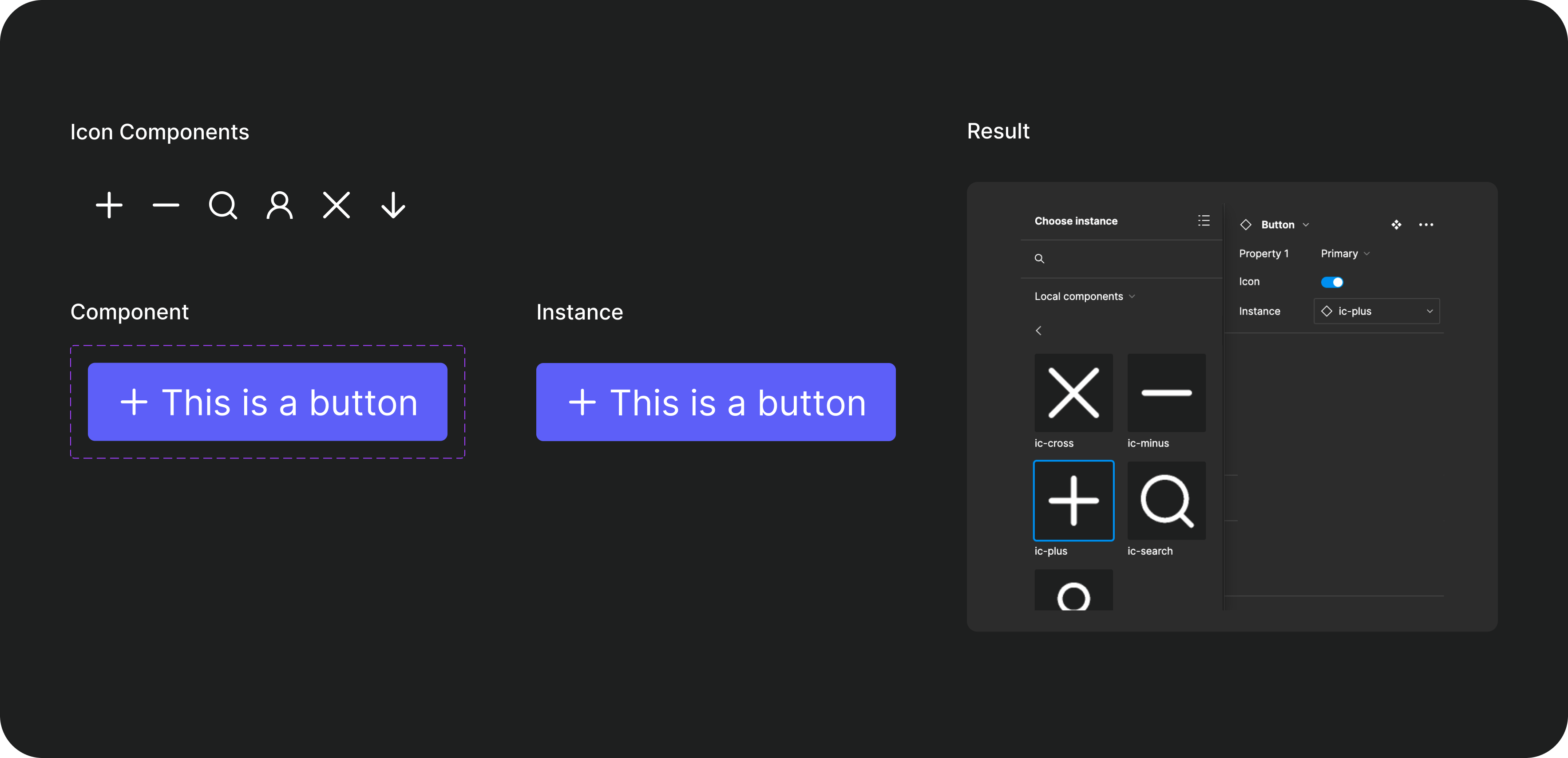
How to use it
- Select an instance of a nested component inside the parent component
- In the right panel, click on the ‘Apply instance swap property’ icon next to the instance name
- Give the property a meaningful name
Where
- Swapping icons
💡 There is no constraint on which instance can be swapped. You can create this constraint by grouping the swappable instances in a frame and giving them a meaningful name. Make sure you also mention the frame name in the description.
3. Text Property
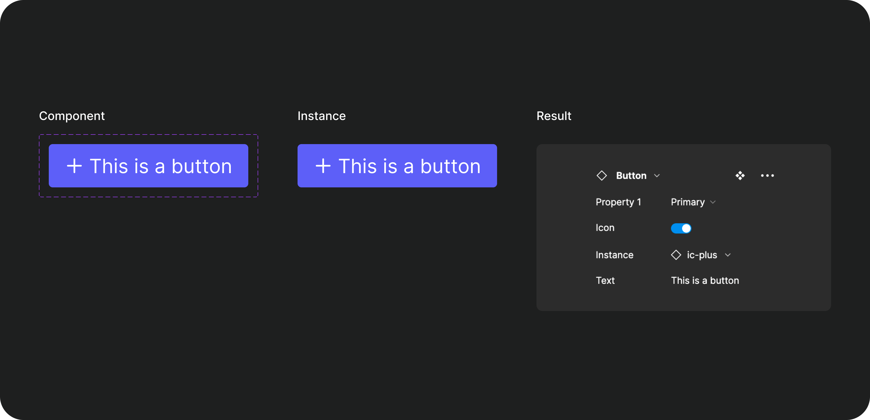
Allows you to customize text layers from the component properties. This is also intuitive to showcase where the text can be customized. Moreover, this keeps any text changes consistent while switching the variants.
How to use it
- Select a text layer in the component
- In the right panel, click on the ‘Apply text property’ icon in the content section
- Give a meaningful name to the property, and a default text
Where to use it
- Input boxes - No need to change the label text individually in the filled and unfilled state of the component
- Tables
- CTAs
Additional two cents on components 2.0
Although the new properties make designing so much easier, some do come with a bit of a learning curve. After using the newer components for the past month here are some issues I’ve faced:
- Adding properties to a different layer is not as intuitive as one would think; why is ‘Create Property’ under ‘Layer’ and not in the component section?
- While the concept of properties now allows us to drastically reduce the number of variants we create, this would insinuate making changes to our existing design systems. It’ll be arduous and time-consuming but it’s a journey I’m willing to go on; considering how helpful it will be in the long run.
- Nested components just got a whole lot confusing. Now, if we nest components we cannot add the properties to the base component. Also, it would be much easier if we have a ‘Variant Swap’ like ‘Instance Swap’. Would save us considerable time and effort trying to find the right layer.
A special shout-out to Washi Tape
One fine Friday evening, as per our team ritual, all the designers got together on a Figjam to do anything but design. That's when we came across the magical Washi Tape feature. We spent the next 45 minutes taping anything and everything we could find and exploring all the different patterns (Note to non-designers, this is a part of our creative process).
Come Monday, coffee in hand, hair in a mess, we realized Figma pulled a classic April Fools prank on us. The washi tapes were gone! However, they did drop the feature a few weeks later and boy are we glad. Though I've never used it as extensively as I did that day, it feels good to know I've got the ability to use some Washi Tape when I need to.
Conclusion
Figma is constantly dropping new updates to make the life of designers easier and for that, we are ever grateful. Thank you for all these new updates, they’ve been game changers. For any of you who haven’t checked out some of the talks from Config ’22, here’s one of my favorites.
Always Beta: Memetic Branding in the Digital Age - Charl Laubscher (Config 2022)
I’d just like to end by saying, (Figma if you’re reading this) one of the features I would really love to have is multiple pages in Figjam!
Thanks for reading and have a great day!
Song of the article: Explore, Be Curious by Cloudkicker
Enjoyed this article? Don't miss out on more exclusive insights and real-life digital product stories at LeadReads. Read by Top C Execs.
Join here.
About the Author
Tanya is a UI & UX designer at Wednesday Solutions, and she loves everything that has to do with problem solving, Figma, and design systems. The excitement to build a future that will be used by millions is what drives her. Oh, and definitely pasta!