

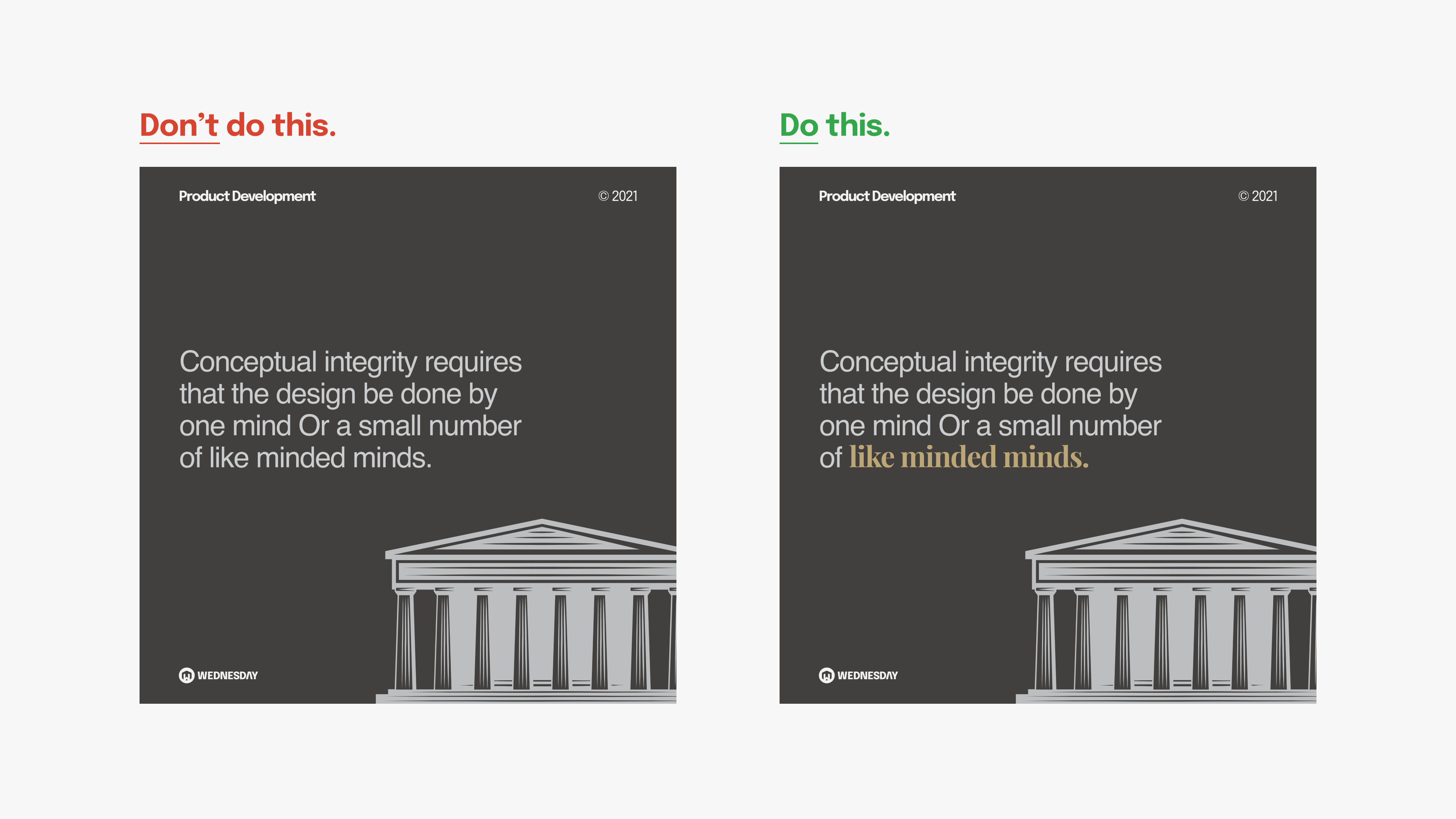
Often times the last decision designers make is selecting a type. They focus is more on graphics, colors, layout, and copy. Type however is one of the most important elements of design. Text is all around us and we're constantly consuming it. Type allows you to associate an emotion and mood to the text. It's an entire field of study.
In this article, you will learn typography tips and tricks. How you can implement them in your marketing posts. Each section has an "In Action" part with examples from our very own social media posts.
Before getting on further, I would recommend you to take a look at some of the basic terms used in the world of typography.
Here is your road to master typography and to stand out in the field of graphic design.
1. Less is good
It is always advisable to stick to a single font family or a proven font combination. Serif and sans-serif font pairing leads to a good reading experience. However, not all font combinations work well.
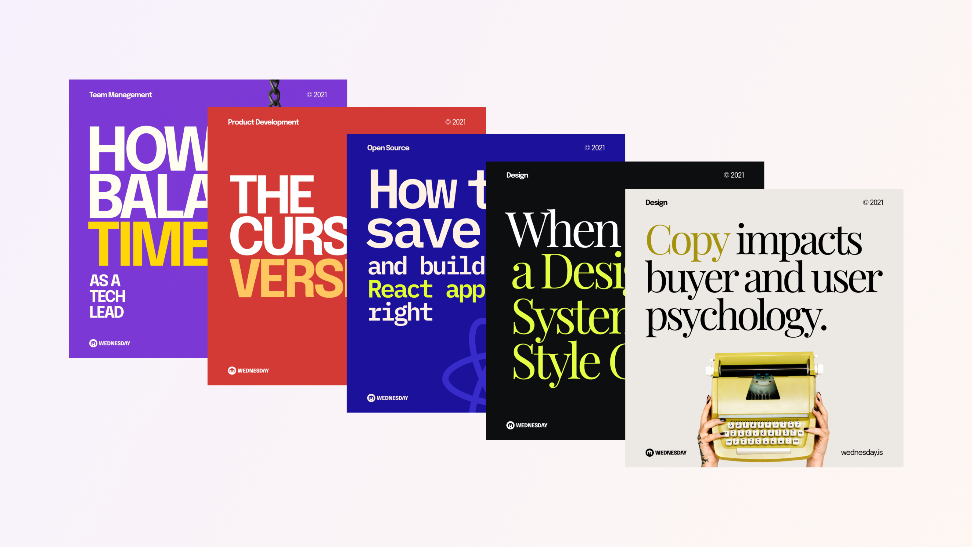
In Action
In one of our posts, we used Playfair Display and Epilogue as a font combination. The body text in the first slide uses Playfair Display and the heading uses Epilogue. The heading looks fine but the body is barely readable.
This is because Playfair Display is a display font and is not generally used for paragraphs. Interchanging both the fonts in the second slide **makes the design look more contemporary and pleasing to the eye. You can check out the post here.
Pro tip: Use WhatFont extension for Chrome to identify fonts that work together from any website.
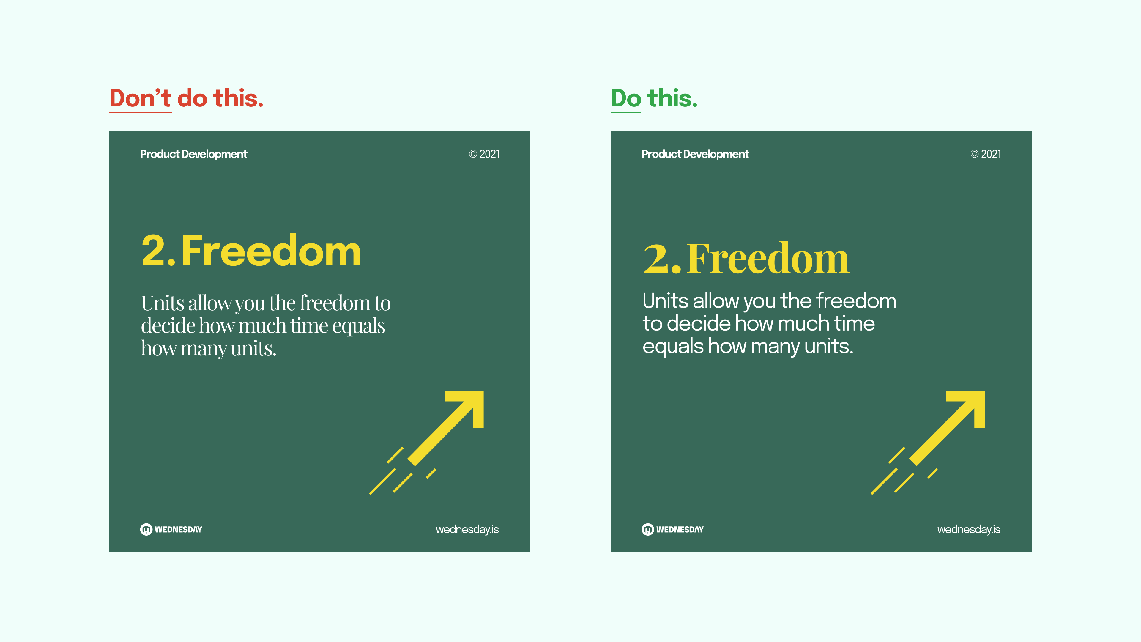
2. Create Contrast
Separate your text into headings and paragraphs. The best way to do this is by creating contrast. Contrast in typography doesn't only mean creating text with different colors. It includes contrasts in - colour, size, proximity, font-weight, background colour, etc.
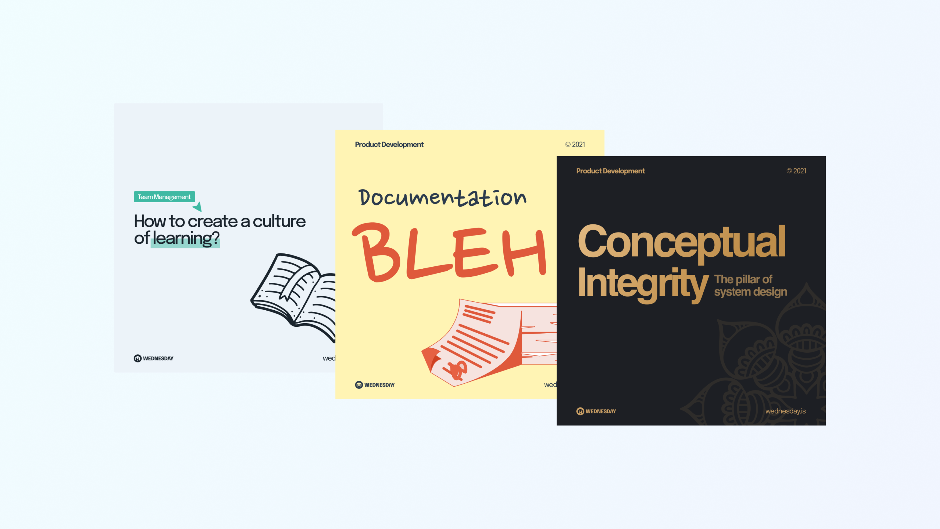
In Action
The post shown in the image post is perfect to illustrate the use of contrast. It has a lot of text blocks. The reader may miss the important points that the writer wants to say.
Let's solve this together. Here are the problem areas - no colour variations, no distinguishable difference between the heading and subheading, and too cramped.
Here is how we can solve this:
- Contrast in size: Double the size of the heading compared the the subheading.
- Contrast in colour: Subheadings are given a different colour compared to the paragraph
- Contrast by proximity: Paragraphs are grouped in a way that the reader is able to different blocks. No bullets of numbers are needed.
You can check out the post here.
Pro tip: If you are using Figma, try using the Contrast plugin to check contrast ratios of colours.

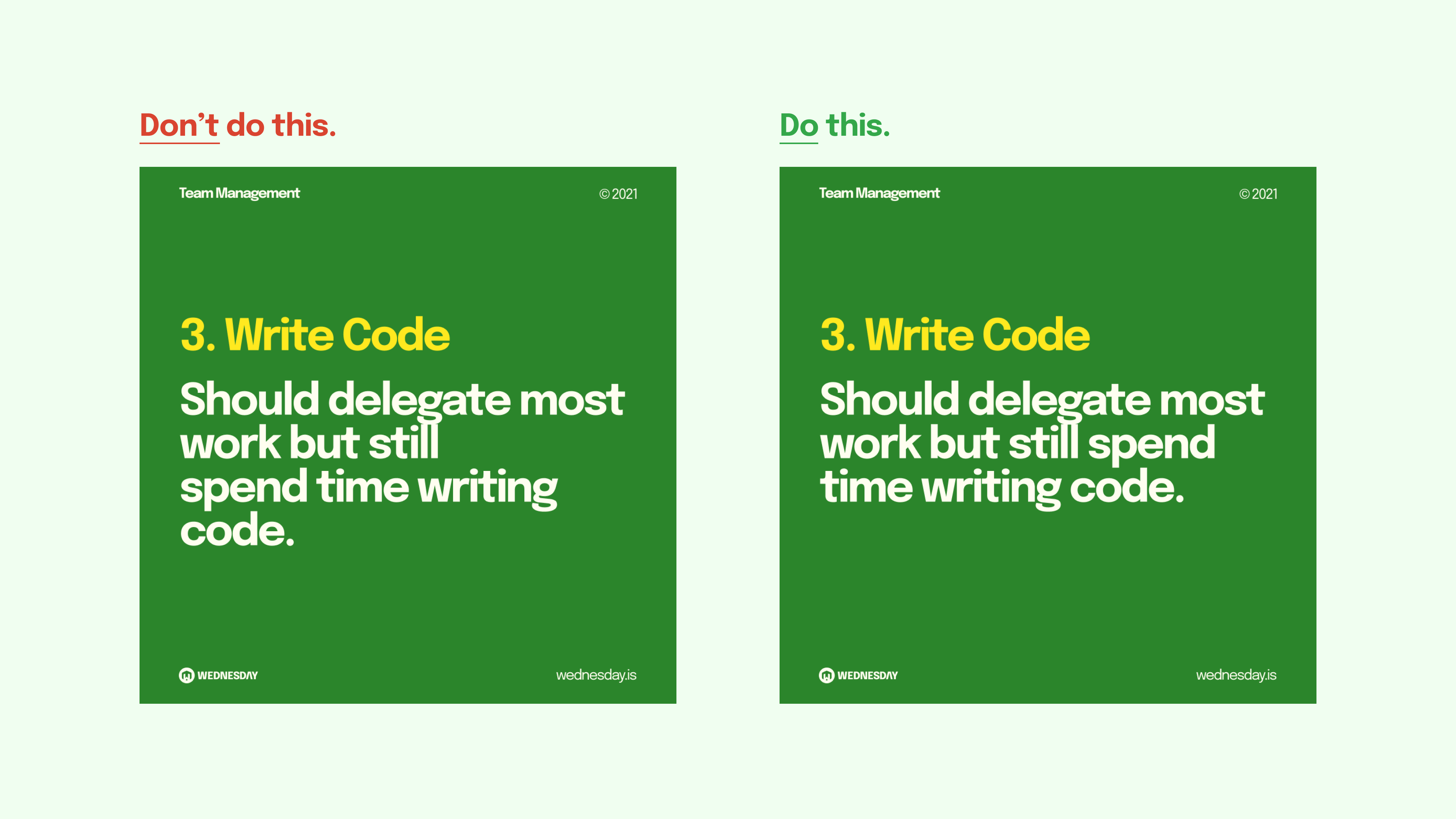
3. Create text blocks
Text blocks are important while working with large text copy. The idea here is to fill a box from left to right without any spaces.
In Action
The body text in the first slide seems to be hanging out from the text box making it awkward to read. It also doesn't look good on the eye because of the empty space.
The words in the second slide have filled the empty space and now they appear to be part of the same text box. Reducing the font size might be an option in designs that have long words. You can check this post out here.
Pro tip: If you cannot fit a word to form a block, use an image or illustration close to the white space and wrap the text block around it.
4. Increase Readability
Social media posts should be bright. But they should be readable with no strain on the eye. Factors like font size, contrast, and alignment are important.
In Action
As shown in the image below the first slide has a low contrast text. Contrast in colour theory means colours that are opposite to each other on the colour wheel.
Since we are also designing for mobile screens, colour and font size are important to keep in mind. You can use a colour wheel to find the right complementary colours for your design.
For the font size, do not use font sizes less than 35 for Epilogue. Font sizes differ for different fonts so it is best advised to check your design on a phone before making it public. Also, People generally read text from top-left to bottom-right. It is advisable to align text to the right except for some special cases. You can check out this post here.
Pro tip: Use the Figma Mirror app to preview your designs in a mobile phone directly from the Figma canvas.
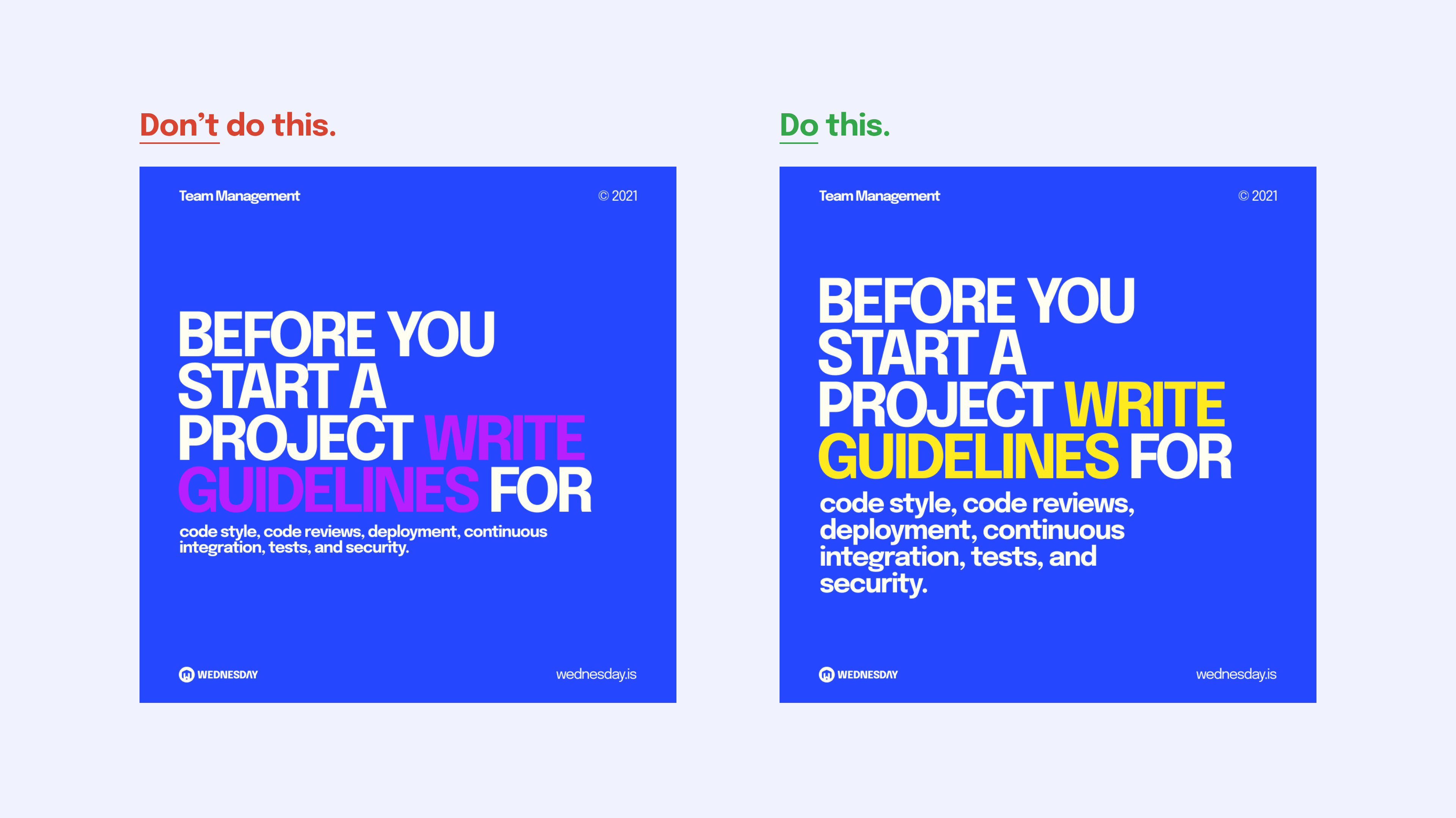
5. Highlight Text
Readers do not always read an entire slide. Highlight important words in your post. You can also try using different colour combinations in the cover images of your designs to make the most important part stand out.
In Action
Take a look at the image below. The design on the left is great, but the reader is not directed to a specific part. Given short attention spans, the reader may lose interest.
To avoid this, we highlighted a part of the text with a different font. Also, keep in mind that you cannot highlight any part of the text. The highlighted text must fit into the context of the post. There might be cases where you do not want to highlight any part of the text. You can check out this post here.
6. Consistency is key
Users should identify your brand by just looking at the design. Brand identity is essential for achieving this. Create brand colours, typography, and guidelines for marketing posts. Always try to follow these guidelines for a consistent look at your portfolio.
Colours and fonts do not have to be the same to maintain consistency. Guidelines can be laid out to follow a set of colours and a particular font combination. For example, colours with a saturation value of 100 with Epilogue and Playfair Display fonts.
7. Break the rules
Some guidelines may not fit into the context of a particular post. Break the rules. Breaking the rules that you have created allows you to give a fresh perspective. It helps convey the vibe of the post.
Enjoyed this article? Don't miss out on more exclusive insights and real-life digital product stories at LeadReads. Read by Top C Execs.
Join here.
Where to go from here?
Here are some social media accounts that put typography to good use in their marketing efforts:
You might want to check out bazen.talks on Dribbble who gives some valuable insights on social media post design.
If you want to explore typography in depth, head over to Incredible Types or Fonts In Use to find a curated collection of typography designs.