
The ultimate guide to building landing pages
From the moment a user reaches your landing page, a timer goes off. You’ve got roughly 15 seconds to convince your user this is where they want to be. So, how do you get your user to commit? How do you make sure your landing page has got what it takes?
The human attention span has dropped to 8 seconds .(If you’re still here, I’m honored.)
So, what is a landing page?
Before we get into the nitty-gritty, let’s quickly talk about “landing pages”. A landing page is a standalone web page created to cater to very specific business goals; it could be a marketing or an advertising campaign or simply to create a brand presence. This is where a user “lands” when they click on a link in an email, an ad, or from a homepage.
Unlike a homepage, a landing page is designed with a single primary goal. It is essential to know the purpose of your business which in turn will allow you to dictate the goal of your landing page. Do you want users to join the waiting list for your product? Do you want them to sign up for your newsletter? Or lead them to an offer? Or do you simply want to create brand awareness?
While most business goals are geared towards a definitive action, some landing pages are simply built to create awareness. Start by first identifying your main business goal and then move on to what you are trying to convince your user about. As cliché as this may sound, to convince your user you need to step into their shoes (or Crocs, or socks).
Time for some role-playing!
- Start by closing your eyes (who saw that coming?)
- Try to piece together how your user reached your landing page; what is their current headspace? Are they looking to explore? Are they here because a marketing email redirected them?
- Take a few moments to understand if you are the right user for this page. There is no point in selling to everyone. How do you make sure your landing page caters provides a solution to that small set of target users?
- Now that we’ve established the what, let’s move on to why are they here. What is your user trying to solve and how close are they to taking a definitive action? For example; while selling a product showing a slash in price or mentioning a “limited-time deal” creates a sense of urgency in the user and closes the gap to converting your user.
Remember, the overall goal of your landing page is defined with the help of a CTA (Call To Action). Typically, landing pages contain ONE main CTA that completely grabs the users' attention.
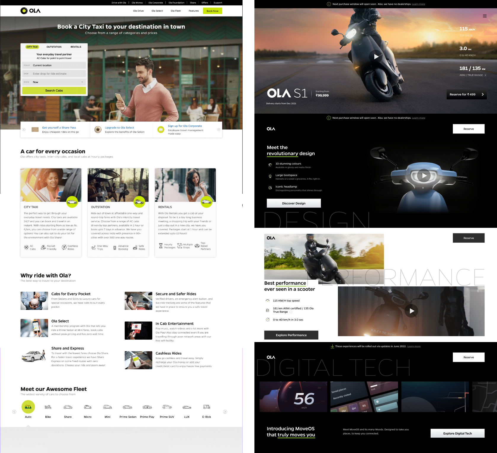
Ola’s website vs a landing page for their electric scooter While the home page has dozens of distractions, the landing page is focused. They have used the help of big visuals and clean design to keep the user engaged. The big text upfront with good copy throughout keeps the user scrolling.
Best practices to build an effective landing page
Nowadays, building landing pages is advertised as something you could put together while watching an episode of Curb Your Enthusiasm (no offense to no-code platforms, we are big no-code supporters at Tuesday). Trust me, there’s more to it than simply drag and drop.
Here are some landing page best practices to get you started:
1) A simple navigation
A landing page has ONE single goal so it’s important to keep all distractions at bay. One way to do this is by ensuring your navigation is straightforward; remove unnecessary links and secondary CTAs.
Whatever be our attention span, it is no secret that given multiple links at hand, we would love to hop around and explore, thus moving away from the subject.
2) The first fold trick
Those first 1440x900 pixels are where it’s all happening. Out of the 15 seconds a user spends on your landing page, 80% of it is spent on the first fold. Make sure your brand’s headline and CTA are clearly visible in the first fold.
3) Keep it interesting
Use different media, like images, videos , and GIFs, to keep your landing page engaging and interactive. Not only does this stop your user from “bouncing” but it’s also an effective tack for explaining how your product/service works
4) Create a sense of trust
One way to convert your user is to make them feel safe. A sense of stability is essential; whether that comes from the brand voice, your copy, or including testimonials from satisfied customers. Alternatively, trust is built by knowing what not to do. At the age of 7, I convinced my parents of the ONE thing I absolutely wouldn’t do if left home alone, burn the house down (they believed me). Sometimes, talking about what you know you shouldn’t do reassures the user and helps them feel safe.
5) Use convincing copy
Great copy should be effortless and should roll off your tongue like the latest song by the Gorillaz. Landing pages benefit from keeping the content short and straightforward; try to use fewer paragraphs and more bullet points.
6) Responsiveness is key
It’s no shock that most users are browsing on the go; on the way to work or while eating lunch. This means smaller screen sizes and slower load times. Make sure your landing page fits all screen sizes and allows uniformity and seamlessness.
7) Test and track your landing page
A/B Testing
A/B testing your landing page informs you which version of your landing page results in more clicks and better conversion. Tweaking your headline, changing your offer, or making the color of your CTA more saturated, could make all the difference. Tools like VWO and Optimizely provide plenty of versatility while testing.
Tracking website performance
Performance monitoring helps improve the service speed of your website, which ultimately increases user satisfaction and retention. There are many free and open-source tools across the internet that help you track the performance of your website. Lighthouse audits your page across categories like accessibility, best practices, SEO and provides a detailed report. GTMetrix is another great tool that identifies the issues that are impacting your performance and also provides the appropriate solutions.
Building landing pages; the Wednesday way
Step 1: Preliminary research
Like all great design journeys, we begin by understanding our target audience and what is it that our landing page is trying to achieve. Make sure you establish a marketing strategy that clearly identifies the end goal. Grab a sticky, jot it down and keep it within sight at all times. In this phase, we create a Figjam and carry out brainstorming sessions. Our whiteboard is usually a collection of:
Personas
‘Know your users’ is a mantra we never lose sight of as designers. One of the best ways to do this is by creating personas. Give your user a name, guilty pleasure, and map out their needs and wants. This allows you to understand the expectations and motivations of your target users which in turn lets you build a successful landing page.
Competitive analysis
This exercise helps deepen our understanding of competitors’ products. It helps us find out gaps in the existing market and add features to our landing page that would bridge this gap. Moreover, it serves as evidence to back up our design decisions. Begin by grabbing a few screenshots of competitors landing pages and note down what works and what doesn’t for each.
Mood-boarding
A mood board is a collection of different kinds of elements; from images to textures that help collate and visualize concepts. Creating a mood board is a practice we stand for as a design team. If I could create my own job title it would be something along the lines of “Mood-Board Maker”. Besides being fun and inspirational, putting together a mood board also allows everyone to be on the same page before the actual design begins.
P.S: To master the mood board, check out this article.
Setting up the skeleton
Once we’ve done our research and everyone is in accord, we start to fill in the blanks. This step involves writing the content; which plays a pivotal role in the success of your page and creating a wireframe to give your page an ideal visual hierarchy.
Enjoying this article? Don't miss out on more exclusive insights and real-life digital product stories at LeadReads. Read by Top C Execs.
Join here.
Writing copy
By this point, we’ve created a new page on Notion and we’re ready to get going! The key to a good landing page is a persuasive copy. Sure, a captivating headline will hook users in, but the way to win over viewers is to make sure all your content is crisp, concise, and convincing.
It’s time to take a step back. We ask ourselves, how can we create a sense of trust and urgency in the user? How do we convince them this is exactly where they want to be? At this point, involving all the stakeholders is beneficial. It helps further understand the brand’s tone and how they want to come across. Here are a few tips:
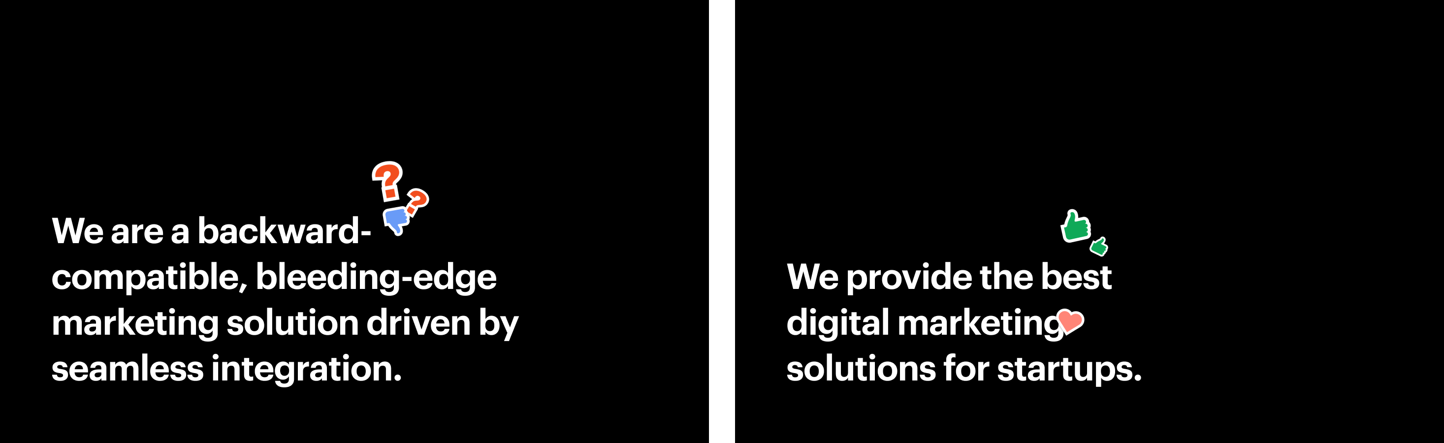
- “We are a backward-compatible bleeding-edge marketing solution driven by seamless integration” sounds smart, but what does it mean? While writing copy for a landing page remember to keep it as simple as possible and avoid jargon.
- Your copy must speak directly to your ideal customer. Try to be as specific about your product/service to narrow down your user base.
- Don’t hesitate to ask for feedback. Run your headline and copy by people around you and see how they react.
- The shorter the better. Period.
Building a wireframe
It’s a Sunday afternoon, you’re in the mall and you see that perfect hoodie. It’s got everything you want: 8 pockets, a little Pikachu upfront, and even a secret pocket! Turns out your size just isn’t available but now you can’t get it out of your head. Likewise, colors and a good typeface tend to distract us and convince us that this design is the best.
Here comes the need for wireframes. Without all the adornments, a wireframe allows you to focus on your information architecture and visual hierarchy. It ensures the proper flow of information along with the landing page. One of the principal concepts of conversion design is creating an information scent. This is a trail you layout on the landing page that you want the users to follow as they navigate through. Wireframes help you do just this!
Page scanning patterns. As humans, we typically tend to scan information from the left. Ideally, it is best to place your CTA on the left-hand side of your page. The F & Z patterns are the most common and effective visual hierarchy patterns followed by designers. Get into it deeper here.
Building a style guide
A style guide is nothing but a set of rules that need to be followed by all designers while they design the components of the landing page. Style guides cover everything from typography to colors. It is key to maintaining consistency throughout your landing page and minimizes decision-making. Believe it or not, you don’t need to use a color picker every time you need that one shade of blue or teal.
On Wednesday, whether we’re building a landing page or a product, building a style guide is imperative. It helps onboard new designers to the project much faster and assists developers in building fully responsive, foolproof products. Enough from me, you can head over here to read more about style guides.
Step 2: Time to start designing!
Only took us 5 steps to get here but it’s time to start bringing your ideas to life! Sure, writing convincing copy helps you convert your landing page visitors but what really keeps them there is the look and feel of the page.
Visual design is unique to every designer and every brand. It’s something that cannot be taught but must be experienced. We try to keep our landing pages as visually simple and clean as possible to help improve visual focus.
Here are some of the main elements of visual design we focus on:
1) Images/ Videos/ GIFs
Using images and videos in your first fold greatly improves your chance to connect with the user. You can use media purely to create an emotional connection, but it can also be used to show your product/service in action. Landing pages built by Apple use beautiful, crisp images on clean, consistent backgrounds that immediately allow the user to feel inspired. Focus on keeping it simple and clean and you’ll see a wonders unravel.
2) Cutoff affordance
Getting our users to convert is definitely the primary goal of the landing page but we also want our users to scroll below and learn more. One way we do this is by using a cutoff affordance or dropping visual cues. Leaving elements on the bottom of the fold incomplete or simply adding an arrow point downwards, prompts the user to scroll further.
3) Colours
You go to a website and it’s usually the colors that make that first impact; they dictate how the rest of your experience will be. Similarly for landing pages, it’s essential to remember:
- Colors set the basic tone and mood for your brand. If your brand colors are already decided, make sure to use them in the right balance otherwise, create a new palette for your brand with a primary, secondary, and accent colour.
- Creating variations of your primary and secondary colours helps your design come together. Use lighter variations for backgrounds and darker colours for text and other elements.
- The right usage of colour plays important role in inaccessibility. To create a good recall for our CTA and ensure readability, the contrast of color matters. Remember, to use an AA contrast checker for best accessibility practices.
4) White spaces
As designers, we sometimes are overcome by the need to fill in the entire canvas to keep the page engaging but, trust me when I say white spaces can make ALL the difference. Using white spaces strategically can help you keep your landing page uncluttered. Adding white space around the CTA, also helps it stand out.
5) A good typeface
Never underestimate the power of a good typeface. Not only is it the base of how your information is getting delivered to users but it also helps create a hierarchy in your design. Type hierarchy is created by using h tags from <h1> to <h6>. These tags also help in SEO purposes while building landing pages.
Be careful while pairing fonts, don’t go below 14px, and keep it fun!
Visual design in itself is a vast and never-ending conversation. Given above, are just some of the main elements to keep in mind to build effective landing pages. Start small, try to pick what’s important for your brand and user type, and work with that.
Step 3: Building the dream design
One of our greatest pet peeves as designers, is with developers not being able to convert our designs into reality, whether it’s a matter of a couple of pixels or the wrong icon. Now with Webflow, at Wednesday we build our own landing pages in a matter of days. Implementing our landing page designs into reality usually covers three phases:
Phase I: Building on Webflow
By following a set of wiki of already established rules for the box model and naming conventions we start by converting our Figma designs into Webflow pages. We begin by building a completely responsive style guide across all breakpoints on Webflow and start building one section at a time, ensuring full responsiveness.
(I’d need another whole article to get into Webflow best practices, but that’s for another day!)
If you haven’t heard of Webflow, you’re missing out. Get started now.
Phase II: Feedback
Yup, we’re back to feedback.
By now your stakeholder might be getting antsy. The release date of the landing page is right around the corner and suddenly, that one paragraph on the page just doesn’t make sense. By using tools like MarkUp, we use the staging site to get any last-minute feedback directly on the website.
Phase III: SEO and final touches
Webflow helps you follow SEO best practices. These help you rank higher in search engine results and make sure, your target user finds your page. At the end of each project, we take some time out and ensure we’re on track to convert more users.
- Using the built-in h1 to h6 tags on Webflow that serve SEO purposes. Your main headline, that has your main keywords for SEO matching should ideally be an h1 and so forth.
- Adding alt text for images. These help bots crawling the web read your content better. A good alt tag will describe the image and its context.
- Adding meta title and meta description to each page allows the user to briefly understand this is where they want to be at first glance.
- Building a helpful and easygoing 404 page. Let the users know what went wrong, offer them a way out, and take the blame!
- Designing open graph images, favicons and web clips is one of the finishing touches to the Webflow process.
Step 4: Going live!
Press publish and voila, you’re now one of them(in a) million landing pages out there.
You made it but the journey doesn’t end here. Keep your landing page up-to-date, respond to your users’ queries and keep tracking it using analytic tools to help govern future decisions.
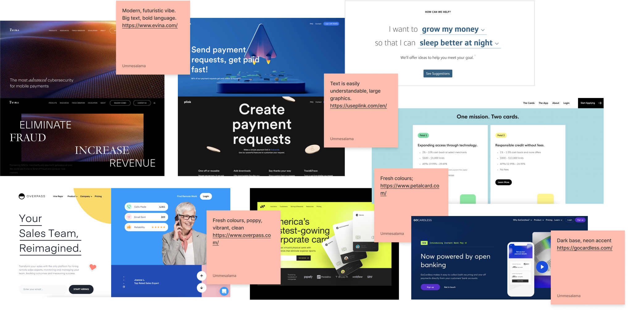
Landing page inspiration
Here are a few of my favorite landing pages. Have a look and you’ll know just why!
No-Code Conference 2021 | Webflow
SuperHi Basic Income - Applications now closed
Build - The Future of Fintech is here
An Endnote
Designing a landing page will always be a challenging task, especially with all the edgy content going out nowadays. Most landing pages these days use BIG copy that takes up the entire first fold and funky buttons with great interactions. They keep the content simple and keep the user curious and wanting more.
Understand your business strategy, get ahead of what your users want and the rest will just fall into place. Keep in mind, if you’re not converting users something simply isn’t working.
Or, do none of that and simply reach out. We build cool landing pages and we’d love to help.
Song of the article: Seven O’Clock by Pearl Jam(I Hope this song helps you create an epic landing page as much as it helped me write this article)
About the Author
Ummesalama is a UI & UX designer at Wednesday Solutions. She loves to make mood-boards, listen to Kings of Leon, and endlessly stare out of windows. Connect with her on LinkedIn here.