As a designer, we all have been there, dealing with inconsistencies in our process and designs. As nerve-racking as it is, it has helped identify a core problem: lack of set guidelines. It can be resolved by making some tweaks to your design process. Starting by setting up a style guide.
Designers love to have a free hand on the canvas. This is great, it encourages creativity. However, the time spent making minor decisions does not seem justified. Starting every page from scratch will lead you to design based on the frame of reference you are in at the time of designing that page. This leads to inconsistencies. These could be simple things like different inline heights, colours, font sizes, etc.
Does this reflect a lack of effort by the team, or does it indicate a lack of a style guide? In this article, you’ll learn how to make a style guide for your project.
What is a Design Style Guide?
A Design Style Guide is a document that provides all of the details essential for your product's user interface. Thus ensuring consistency across the product. It aids in defining what is acceptable to be used in compliance with brand rules, such as font, colours, layout, and components.
Why Care About Creating a Style Guide for Your Designs?
- Guidelines: Guidelines for type, colours, voice & tone are set. These give your brand a visual differentiator. With the guidelines your product is always consistent, and shares the brand message across the platform.
- Save Time: Less time spent debating different visual options or reviewing past examples. You don’t have to spend time guessing which colour you should use to indicate a disabled state, as the decision is already made and documented.
- Onboarding: Easy to onboard new designers as the style guide sets the building blocks for a design. This means fewer “quick calls”. This in turn also significantly improves the team’s performance.
Let’s Get the Lingo Right
These terms are interconnected but they are not synonymous — Style guide, Pattern Library, and Design system.
- Style guide: A set of guidelines designers must follow when they are designing the product or a component of the product.
- Pattern Library: A ‘library’ of reusable elements such as icons, components (Avatar, Buttons, Input boxes), and a combination of components (Navigation, Dialog box, Forms). A library is made using the style guide.
- Design System: This refers to a wider ecosystem than just the visual aspect of the product itself. It includes a style guide, a pattern library, documentation, code, and more. It dictates how the product functions, and interacts.
Now that you know the terminology, let’s go over what you’ll need to get your style guide up and running.
Getting Started With Building A Style Guide
Before building the style guide it is important to understand your user group and brand values. This helps you make decisions regarding the style guide with a user first approach, and ensuring the brand’s message is being communicated across the product. Get those creative juices flowing with a playlist and coffee. Here’s a simple 4 step-process to building a style guide for your UI and product designs:
- Make a spacing system
- Set up the grids
- Create the typography scale
- Build the colour palette
Note: Each step of building a style guide is a subject in itself. To not digress I’ve added a ‘dig deeper’ section for you to... dig deeper.
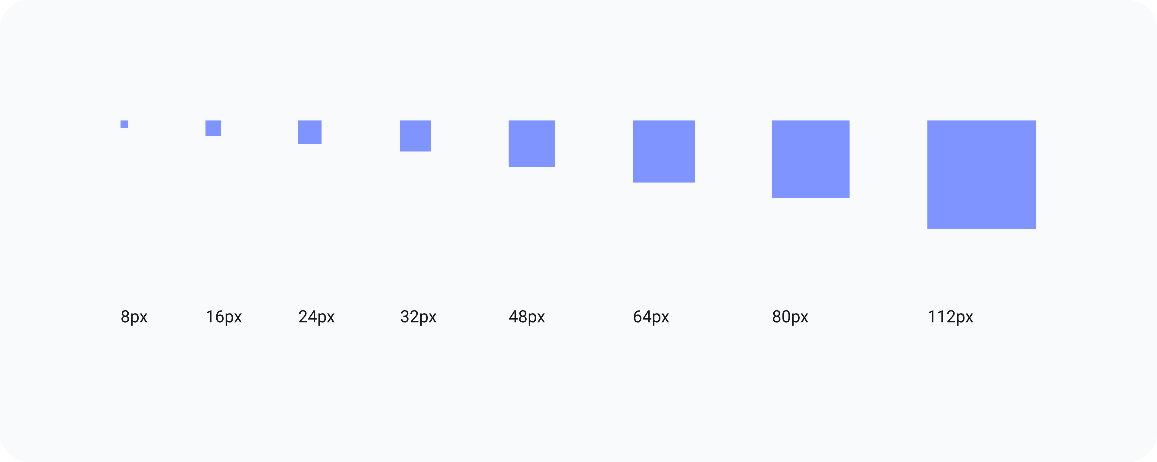
Step 1: Make a spacing system 🛸
Justapracticalexampleofwhythespacingisimportant. That is not gibberish, that is “Just a practical example of why the spacing is so vital". Proper spacing ensures better information consumption for your users and a spacing system ensures consistency.
Start by selecting the right base unit. I use 8px as the base unit. It is scalable and provides a comprehensive range of options to build a visual hierarchy (also because apple and google suggest). Next, create variants in your base unit that get space in your spacing system.
Do this by using multiples of the base method as it is easy to remember, and creates asymmetry. Overall, 6-8 values in your system are adequate. It provides enough alternatives and keeps decision-making time minimal. Another point is to ensure adjacent values provide enough visual distinction. For example, choose between 40px or 48px, but not both, as they are visually similar.
⛏ Dig Deeper: A harmonious spacing system for faster design-dev handoff
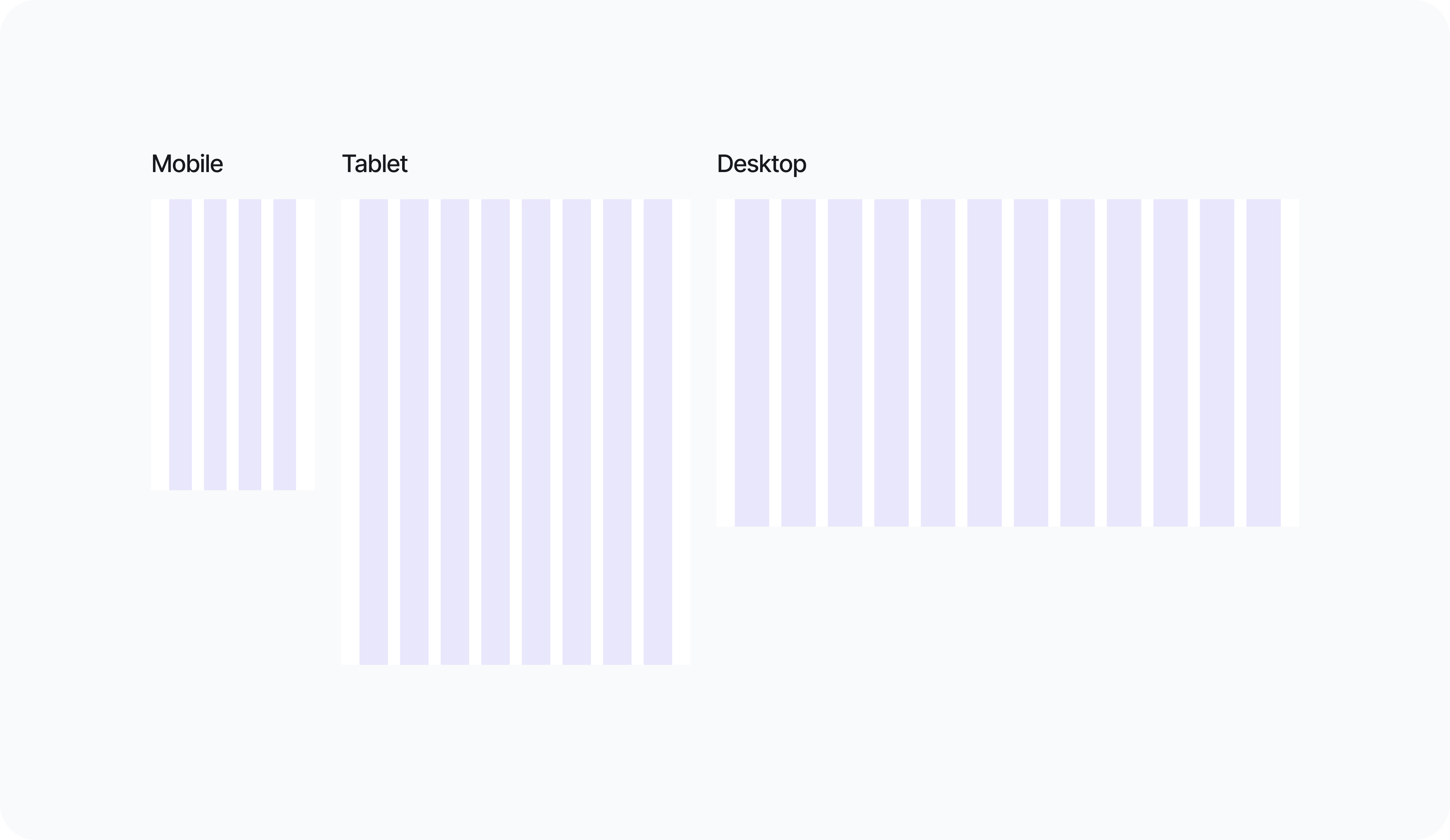
2. Set up the grids 🖥
Grids are the guidelines that define how the layout will adapt to different screen sizes. This makes sure that our designs are both seamless on screens that are currently in use, and future-proof. Additionally, a grid minimises decision-making and produces a consistent layout.
While creating a grid, you need to ensure the margins, and gutters follow the spacing system created in the previous step.
⛏ Dig Deeper: Figma: How to build responsive and scalable grids for web-design
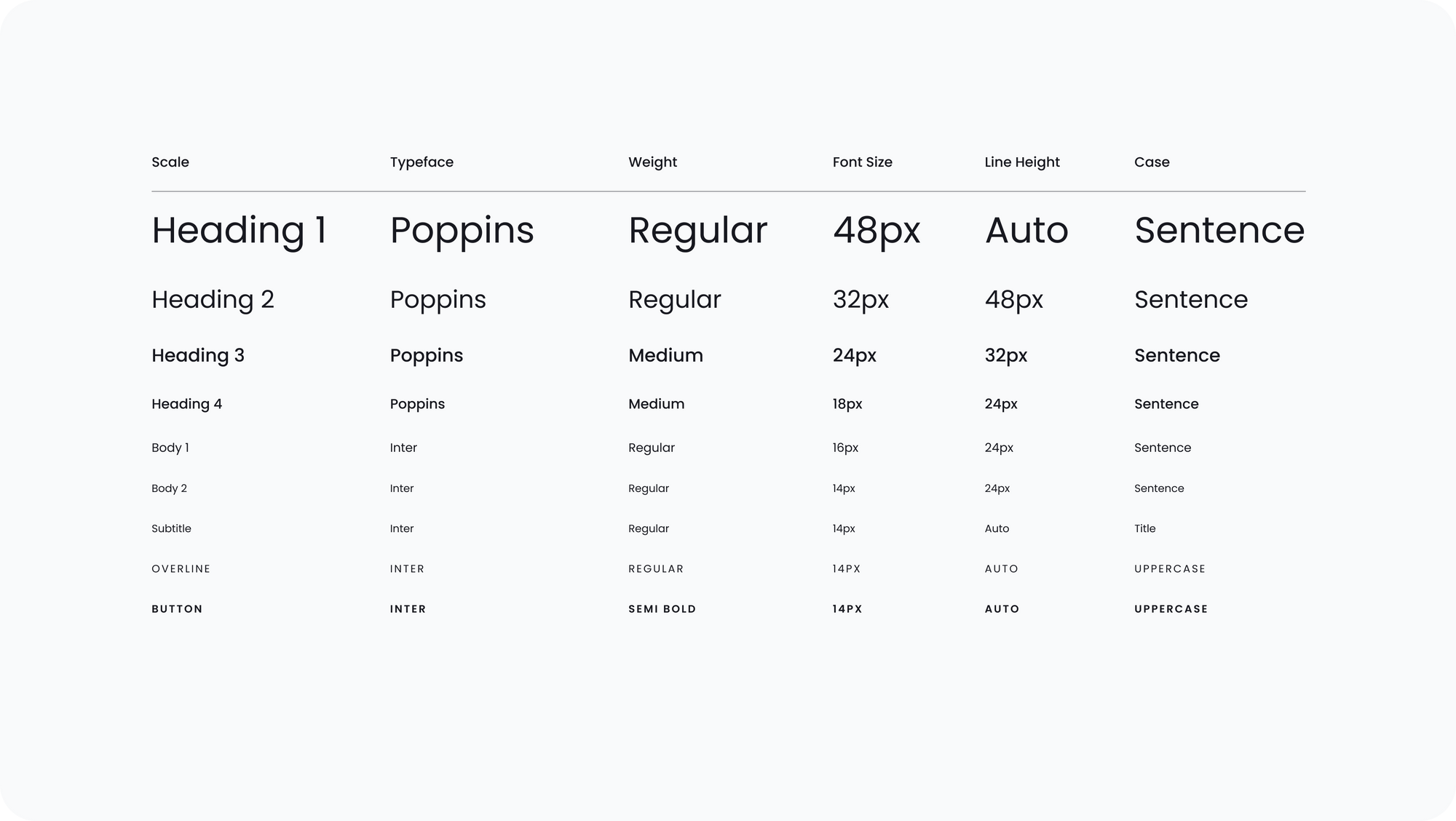
Step 3: Create the typography Scale 🖊
Almost 85% of your screen at any given time is text. Yet, typography is an element that blends into the UI; unless not done well. A robust typography system helps with:
- Readability
- Accessibility
- Visual Hierarchy
- Brand Personality
Choose a typeface that works with your brand tone. A wrong typeface can change your brand’s voice from fun to boring and from professional to amateur. It is also essential that you set styles for all the possible text variations in advance. This includes H1, H2, H3, Body, sub-headings, and button text. Remember that Visual Hierarchy is determined by font size, weight, line height, and tracking.
⛏ Dig Deeper: Typography in User Interface Design
Enjoying this article? Don't miss out on more exclusive insights and real-life digital product stories at LeadReads. Read by Top C Execs.
Join here.
Step 4: Build the colour palette 🎨
Colours are unarguably the BEST way to communicate with your users. With colours, you can grab their attention, alert them before an anticipated event, or provide assurance about a completed task. However, with over 16 Million hex codes, inconsistency is inevitable if there is no single source of truth. So how can you choose the best colour palette?
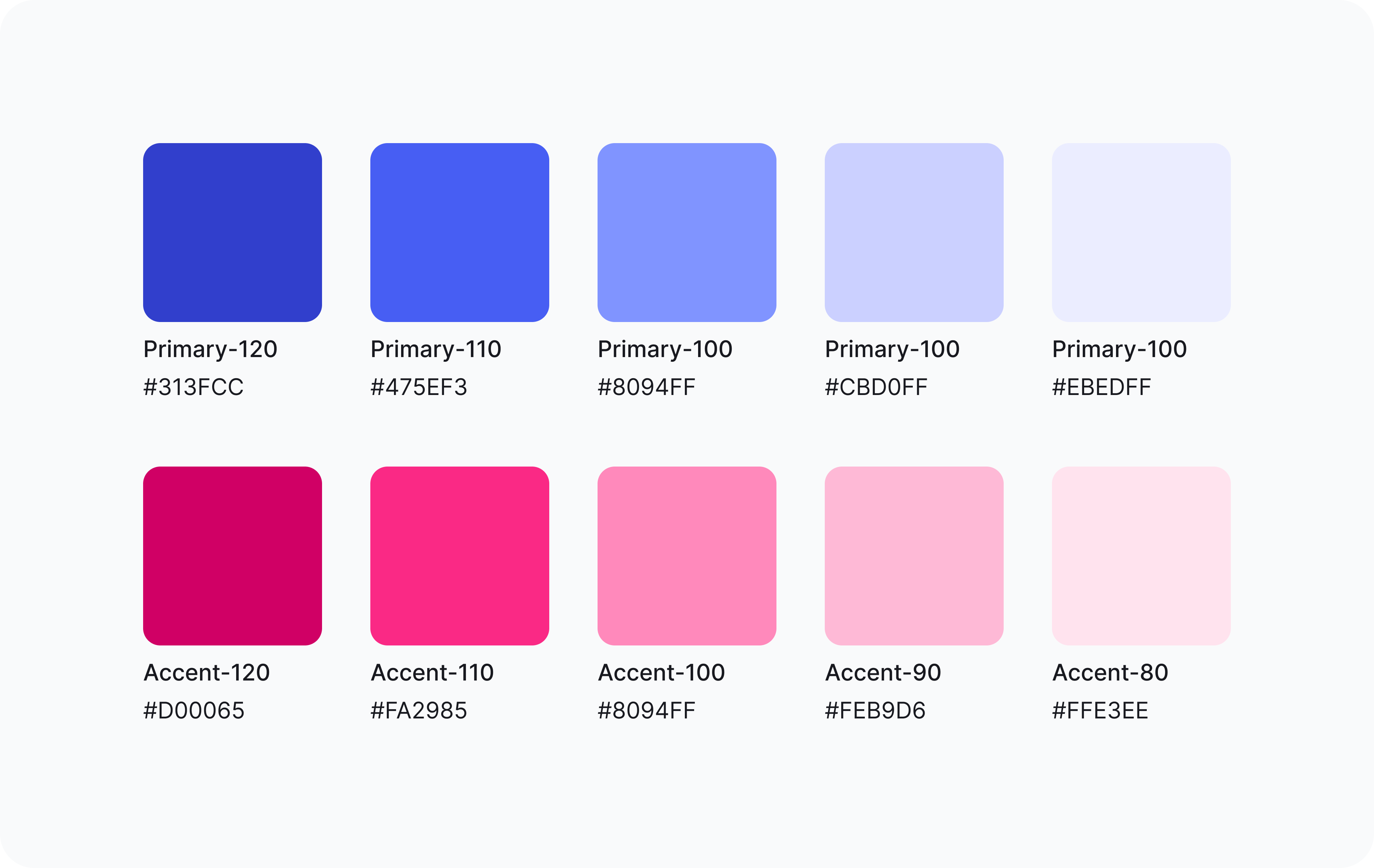
Primary Colours: Start by defining the primary colours. These colours familiarize users with your brand. They are used through your product, and across all platforms to enhance brand awareness.

Accent Colours: Next pick accent colours that aid the primary colour palette, break from the monotony, and grab attention where required.

Neutral Colours: Lastly, fix the neutral colour palette, which, like an old friend doesn't fight for the spotlight and lends a helping hand where needed. These are perfect for background and disabled states.
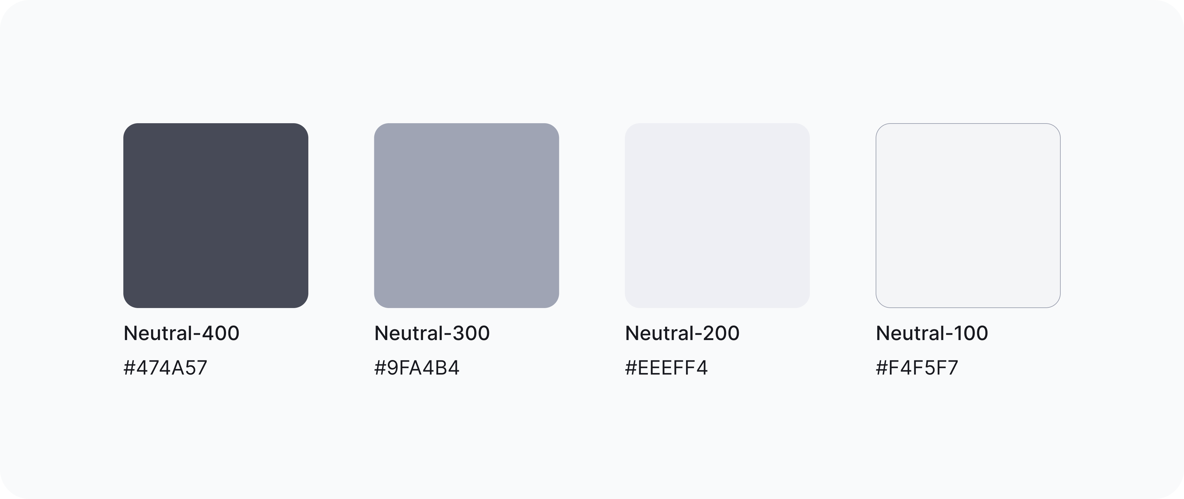
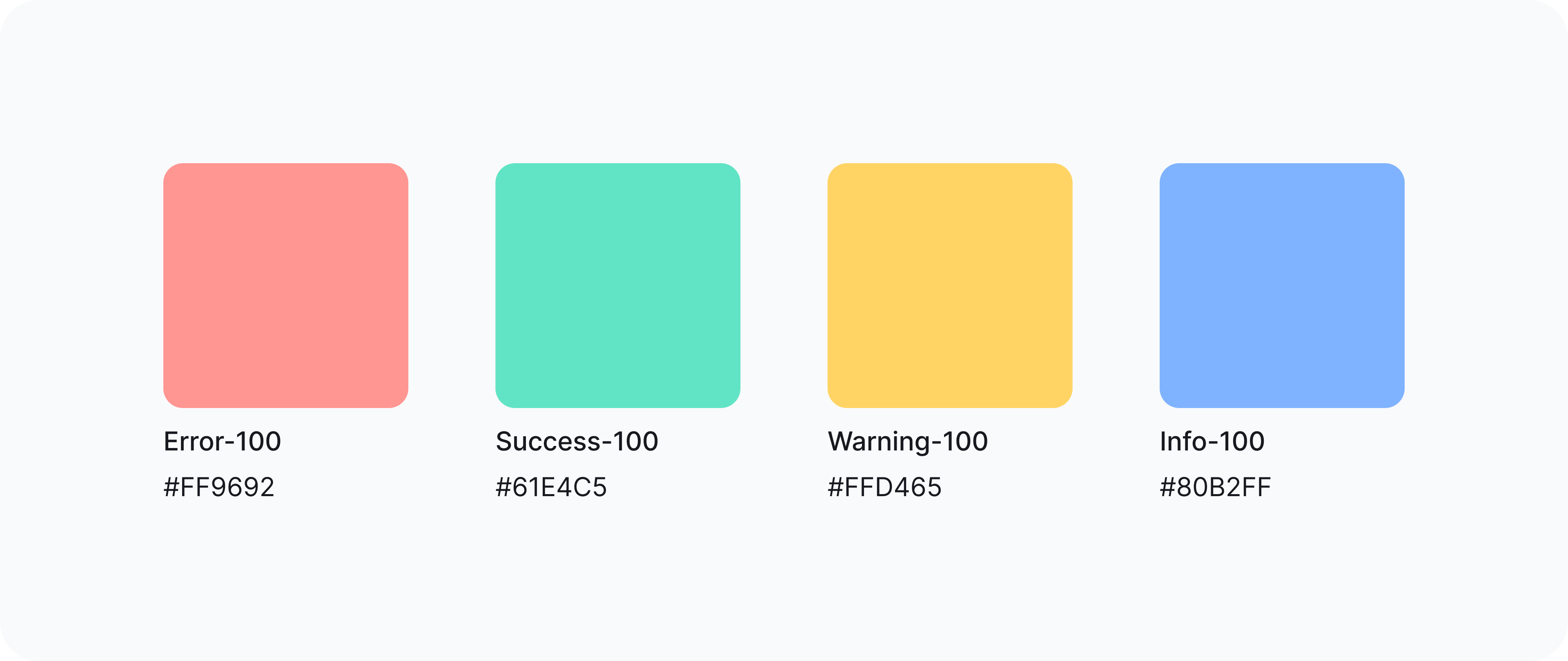
System Colours: A lot of designers don’t consider system colours. Therefore, the developers have to take it into their own hands and define these. No offence to the developers, but supersaturated red does not go with pastel brand colours, as even a noob will agree.
The system colours you need to define are:
- Red for error
- Yellow for warning
- Green for success
- Blue for information
Extended Palette: How many times have you changed the opacity of colour to create a balance? Now imagine how many times another designer has done the same. The probability of having the same opacity for the same purpose is low. Not to forget the new HEX codes that are generated from those (Thanks to colour pickers).
As the product scales, new shades of the base colour prop up. This is how the evil seed of inconsistency creeps into your system. To avoid this, it is prudent to define variants of the base colour, even if you may not need them right away.
With the help of tools like the Materials palette generator, you will be able to create an extended palette for your primary, accent, and system colours.
Champion the cause
A well-made recipe is no good if no hungry stomachs aren’t fed. All the teams (design, marketing, and development) need to be well acquainted with the style guide to maintain a consistent brand image, across all platforms. Be a champion of the style guide and promote it shamelessly. Educate the team with a fun presentation, talk about it during stand-ups, and bring it up during QA. Put a face to the style guide (yours) and be present to help the team with questions or receive feedback.
Best UX practices for a high-quality style guide
As designers, we can all agree that a product is worthless if the user experience is not as pleasing as the user interface. With a style guide, we cater to two user groups — your team, and your product users. To ensure both groups have a pleasant experience here are a few practices to bear in mind:
Easy Access and Layout
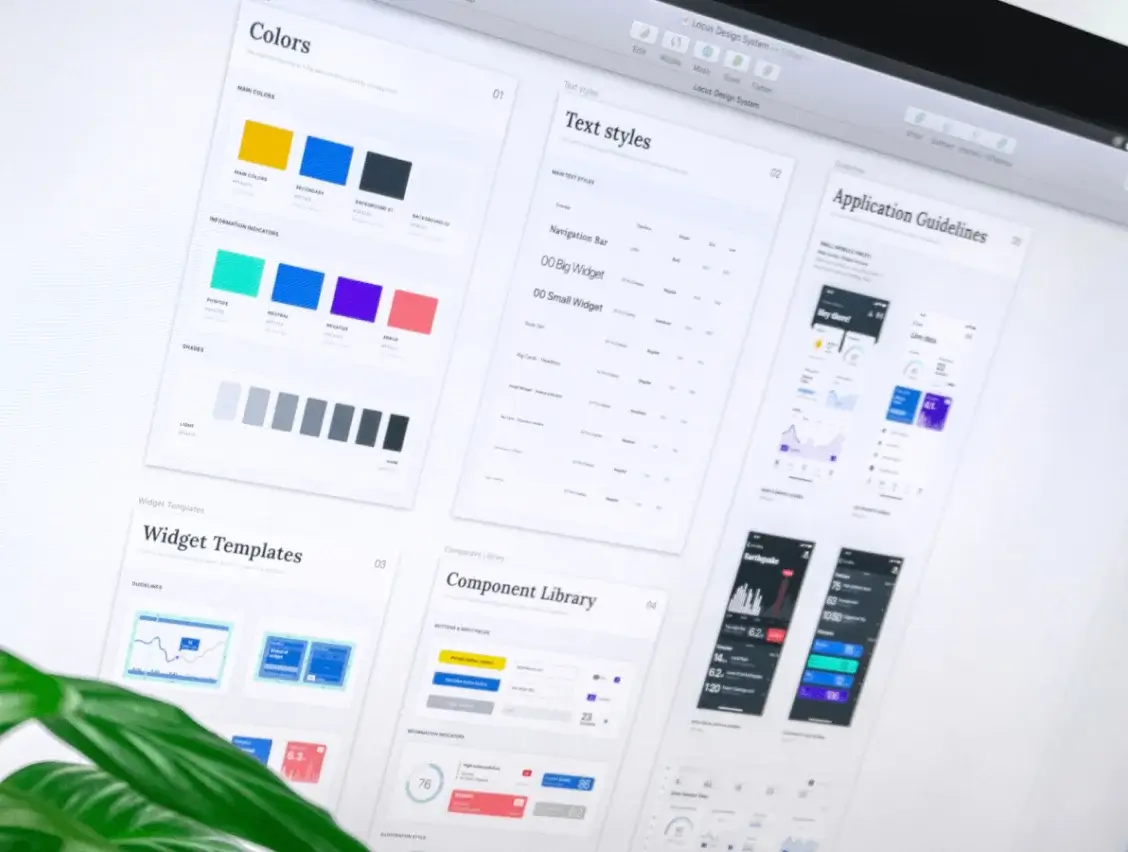
Your style guide must be presented in a way that is easy to navigate, understand, and is aesthetically pleasing. Also, ensure that it is housed in a file that can be easily accessed by all teams. I recommend using a Figma file and dividing each element on a separate page. The option to manage and share styles empowers the design team to use the style guide more efficiently.
Naming Convention
Setting a naming convention ensures everyone in the team is speaking the same language, literally. Collaborate with other stakeholders to come up with a naming system that works for all.
Guidelines
Add guidelines on how each element should be used, this minimizes decision-making time while becoming easy to comprehend. A well-documented guideline includes a short description, the do’s and don'ts, and practical examples.
Accessibility
With tech reaching people all across the globe, your product shouldn't become a barrier for anyone to use. For a truly engaging user experience, your designs need to follow accessibility standards.
Responsiveness
In the current tech scenario, one can’t predict what device their user will use to interact with a product. This is why it’s always a good idea to build something that supports all devices. Build a typography system that adapts to the different viewport sizes to create a more meaningful hierarchy and layout. Also, add guidelines on how the spacing system should be used on different devices.
A Few of Our Favourite Style Guides
Get inspiration from some well-made style guides:
- Starbucks: They’re creative and consistent with their brand language. In addition to their iconic green colour, Starbucks has a varied and evolving colour scheme. They adapt their secondary colour palette depending on the seasons. This helps them stay current yet recognised.
- Atlassian: Atlassian has many products under its umbrella such as Jira, Confluence, Trello etc. By defining a consistent design language for the entire brand and each product, they have done a tremendous job of developing their style guide for scale.
- Salesforce: Salesforce introduced the concept of design tokens. Hard-coded values are replaced with tokens, which enables designers to produce more adaptable design solutions. This creates an easy-to-scale visual system that is also consistent.
If you found this helpful, join the conversation over on our Twitter and LinkedIn. We would love tips on style guides from you!
Conclusion
A style guide helps you and your team save time and build more consistent products. However, building one shouldn’t be overwhelming. Start with what is necessary for your team, and scale it gradually. Keep your team updated about progress, and have fun while you're doing it.
From one designer to another, building the style guide is one of the best things you do for yourself and the team. Another is building a design system, but that’s for a different day. I hope you enjoy building style guides as much as I enjoyed writing about them.
Happy designing!
About the Author
Tanya is a UI & UX designer at Wednesday Solutions. She dedicates roughly 20 minutes of her day to perfecting the texture of her coffee. She loves everything that has to do with problem-solving, Figma, and design systems.