

Okay, I am making a button. I have made a button.
Is the text size okay? Is the padding okay? Will I need an icon here? Is the spacing alright? Is this size looking good on desktop. On tablets? On phone? Does it’s style fit in with the rest of my components? Will the new components I make fit in with the way this button is? There’s still hover states and how will it look on click and what about when it’s disabled..
If you have ever designed any user interface, you have probably seen tiny decisions like these spiralling out of control. It takes up your time and energy and increases your workload. Luckily, we live in an era where design assets have come a long way. We have a sea of UI kits at our disposal which make these tiny decisions, and thereby our lives, much simpler. All you have to do is pick up components from here, modify them according to your style guide and use them in your interface as you planned in your wireframe.
What is a UI kit?
A good UI kit is a set of reusable UI components such as buttons, inputs, navigations, etc. along with fonts and typography styles, sometimes colour style palettes, and other useful design assets and elements. They serve as a great starting point to design any user interface. They help us to quickly make tiny design decisions and maintain consistency, specially if you are working in a team.
Before you select a UI kit, make sure you take a good look at it. See if it has everything you need. See if it’s contents are actually going to be useful for your project. Luckily for you, we have done extensive research and made a compilation of these 15 UI kits which we are sure will be able to cover all your design requirements. Well organised and easy to understand.
| UI Kit Name | Link | Responsive | Uses Figma Best Practices and Easy to Use | Other USP |
| Untitled UI | Preview |  | | |
| UI Prep | UI Prep Design System 6.0 Free Demo | | | Comes with video tutorials |
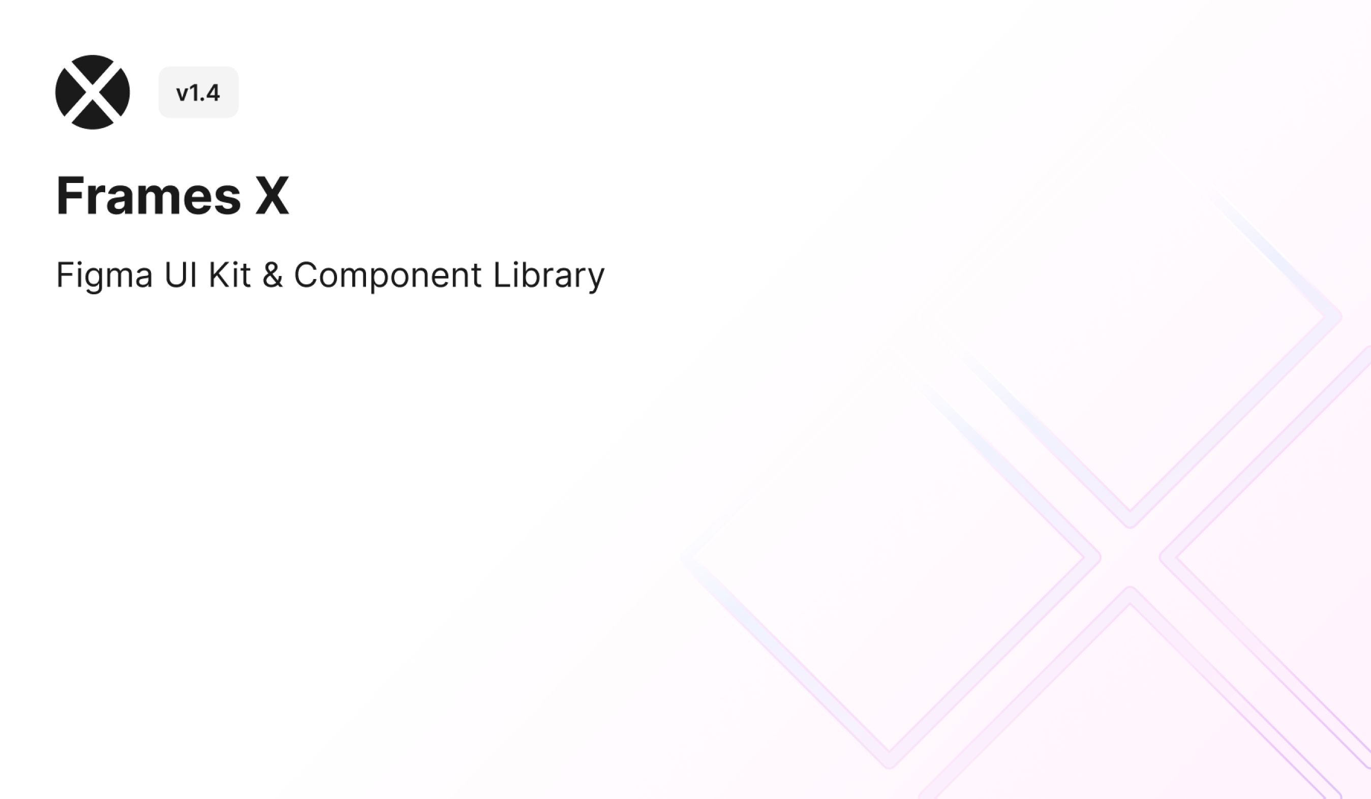
| Frames X | Preview | | | Focuses on accessibility, scalability and reusability, comes with an e-book explaining tricks to optimise workflow |
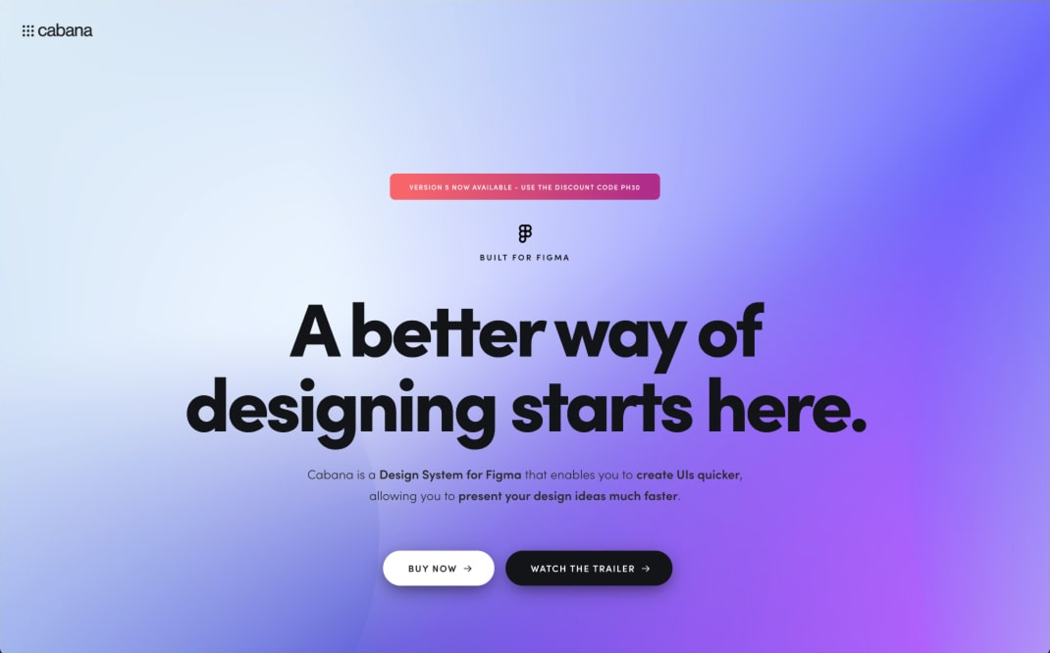
| Cabana | Their website | | | Has ‘blocks’ of sections that can be quickly put together to form designs |
| Ant Design System | Light Mode Preview | | | Based on the popular React UI Libraries called Ant Design |
| FlowBite | Figma Demo | | | Designed for Tailwind CSS |
| Disy Design System | Their Website | | | Minimalistic, modern, sleek |
| Landify | Link to kit | | | Targeted towards landing pages |
| Tetrisly Figma UI Library | The Kit | | | Large kit, has ‘blocks’ of sections that can be quickly put together to form designs |
| Stratum UI Design Kit | Their Website | | | Neat, Modern |
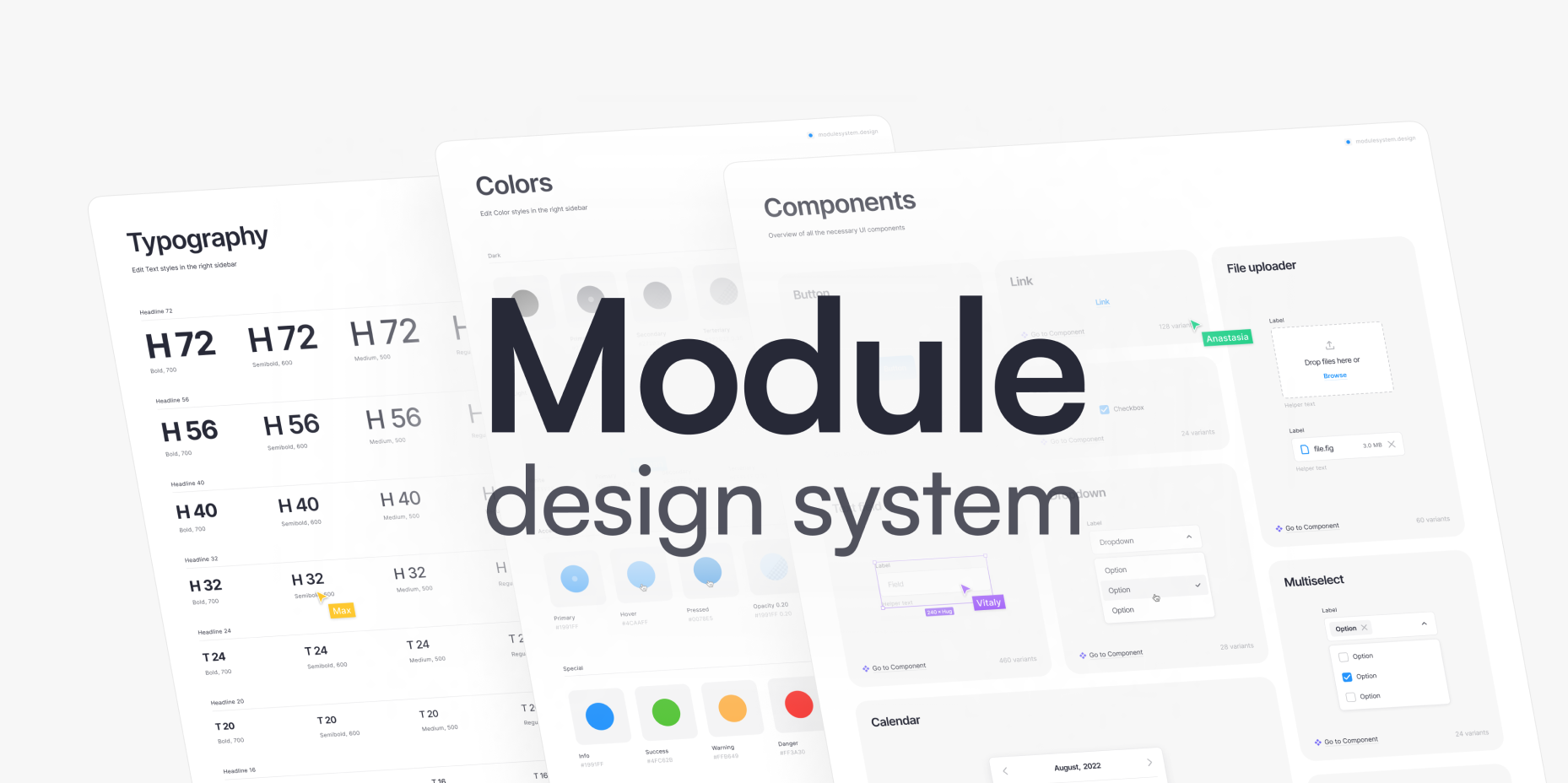
| Module UI kit | Their Website | | | Focuses on keeping things neat, simple, consistent and quick, based on a 4 px grid |
| The Design Encyclopedia | Figma Preview | | | |
| BetaCRM | UI Kit | | | Made for dashboards and CRM |
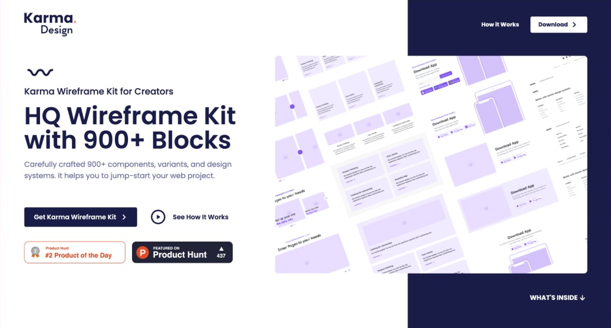
| Karma Wireframe Kit | Their Website | | | Is a high quality wireframe kit and a UI kit |
| Nucleus UI iOS UI Kit | Figma Kit |  | | Free, follows the iOS Human Interface Guidelines, for mobile apps only |
🔗 Free Community Version | Preview
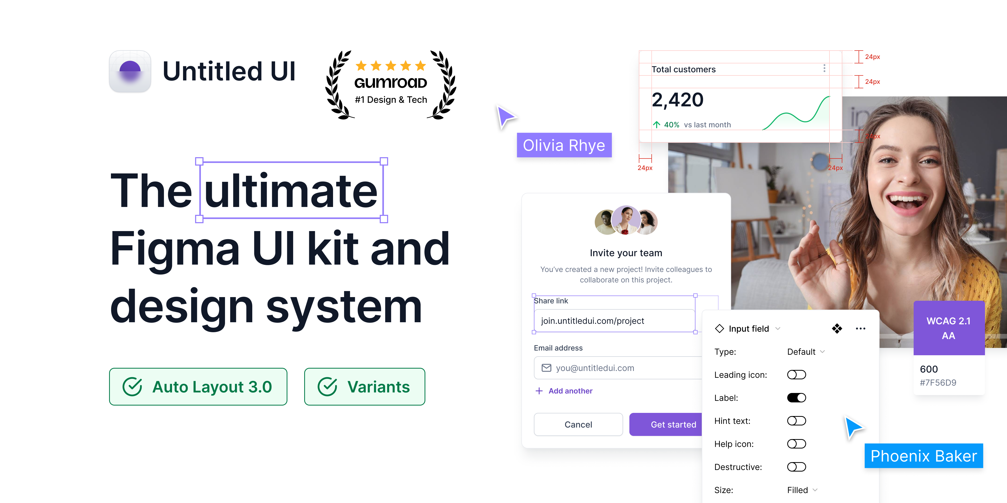
Imagine everything you want a UI kit to have. We can assure you Untitled has everything you thought of and more. Untitled UI goes beyond just typography, colours, buttons and nav bars. They have templates of landing pages, complex dashboards, web apps and much more.
Their team thinks of absolutely everything a designer might need. They also go over and above - they recently announced that Untitled UI has been updated in accordance with the latest component properties and Auto Layout 4.0 announced at Config 2022.
They have their free version here. Accessibility, flexibility and quality are the 3 cornerstones of Untitled UI. With over 10,000+ components, 500+ typography and colour styles and 420+ desktop and mobile page examples, we highly recommend Untitled UI.
🔗 Free Community Version | Preview
Battle-Tested, no Fluff Design System UI Kit for Figma
True to their tagline, UI Prep makes sure you have an easy-to-use, simple and well organised UI Kit. It’s a set of well-crafted, accessible and interactive components with colour and typography styles, grid and layout styles, container styles, icons and even a few UI layout examples.
These components don’t just have have well thought out variants, UI Prep makes sure that it uses Figma’s Auto Layout and Variant features in the best way to help you make beautiful user interfaces in the easiest and fastest manner possible.
They also focus on constantly updating the UI kit by adding more components, providing variants for dark mode and improving the file structure. What we like about them the most is that in their community file, they also mention other resources that can be used in addition to this UI kit, as well as ‘quick start’ video tutorials to get you accustomed to the kit. They really take care of your convenience, ease and speed while designing, trying to make designing interfaces with them the best experience for you.

🔗 Preview
What we liked best about this UI kit is that it come with a 94-page handbook (it’s an e-book) explaining tricks, tips and best practices to not only use the UI kit, but also to build scalable design systems and optimise your design process.
Other than that, it has great components with variants using Auto layout, with dark mode versions. They have colour and typography styles, icons - everything you would expect from a style guide. However having been made keeping novices in mind, whether you’re new to figma or experienced and just looking for a quick UI kit to start off of, Frames X is definitely a great place to start in terms of accessibility, scalability and reusability of elements.
Cabana is a UI kit that has not only the usual contents of a UI kit (they have all of them with variants and and Auto Layout by the way), but also design ‘blocks’ which are layouts of single sections of a web page. They don’t have examples of entire pages, however quickly putting together mock ups of relatively simple web pages or landing pages is extremely easy with Cabana.
🔗 Their Website | Light Mode Preview | Dark Mode Preview
This one is a pretty large UI kit, great for large projects. What really makes it stand out is that it’s based on one of the most popular React UI Libraries called Ant Design. If you’re using React for your projects, Ant Design is going to help speed up your process while keeping everything well-documented, clean and consistent for your designs as well as development.

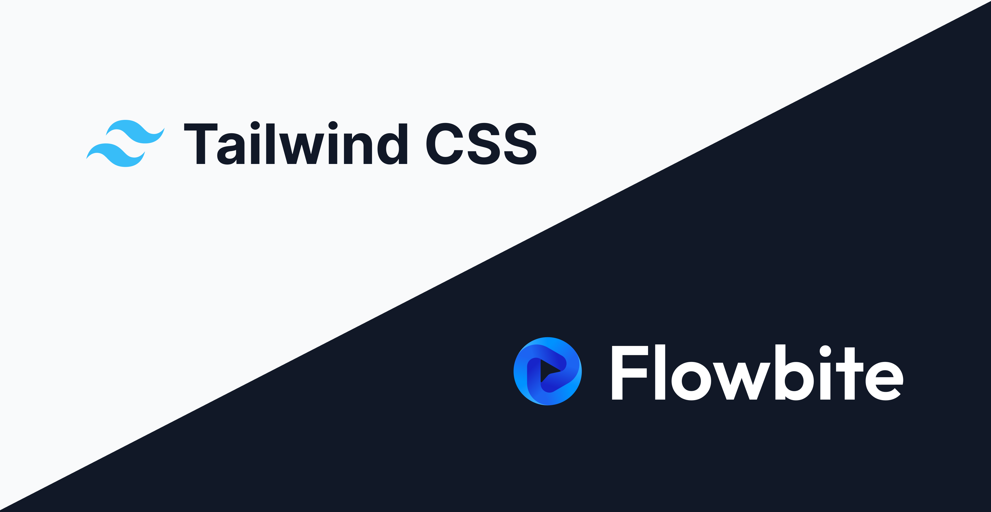
What sets FlowBite apart is that it was designed for Tailwind CSS, a popular CSS framework, in mind. So if you use Tailwind CSS for your front end, Flow bite is a great place to start for quick, easy, consistent and responsive designs.
Enjoying this article? Don't miss out on more exclusive insights and real-life digital product stories at LeadReads. Read by Top C Execs.
Join here.
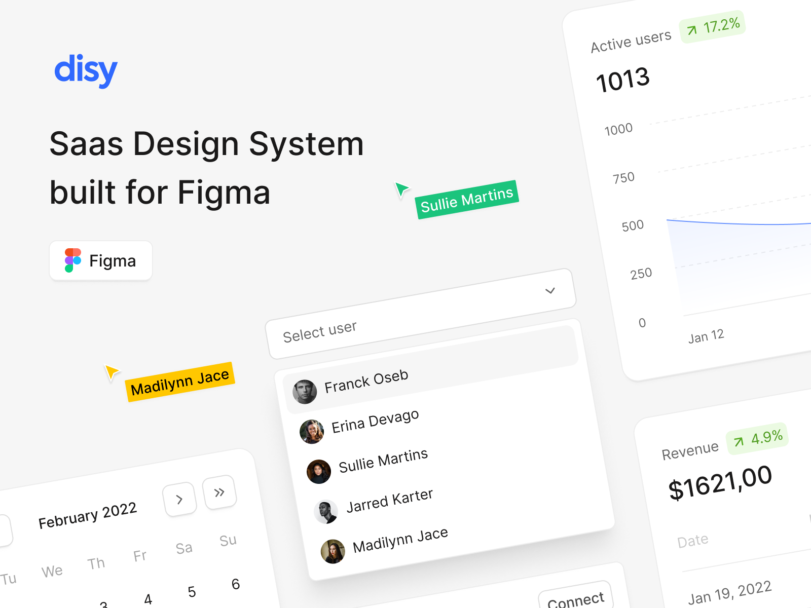
There are two words that best describe this UI kit - minimalistic and human-centered. They aim to be a simple, modern and sleek design system. Bieng one of the smallest UI kits on our list, it may not have everything you want for a huge project. However, it made it to our list due to it’s high quality components.
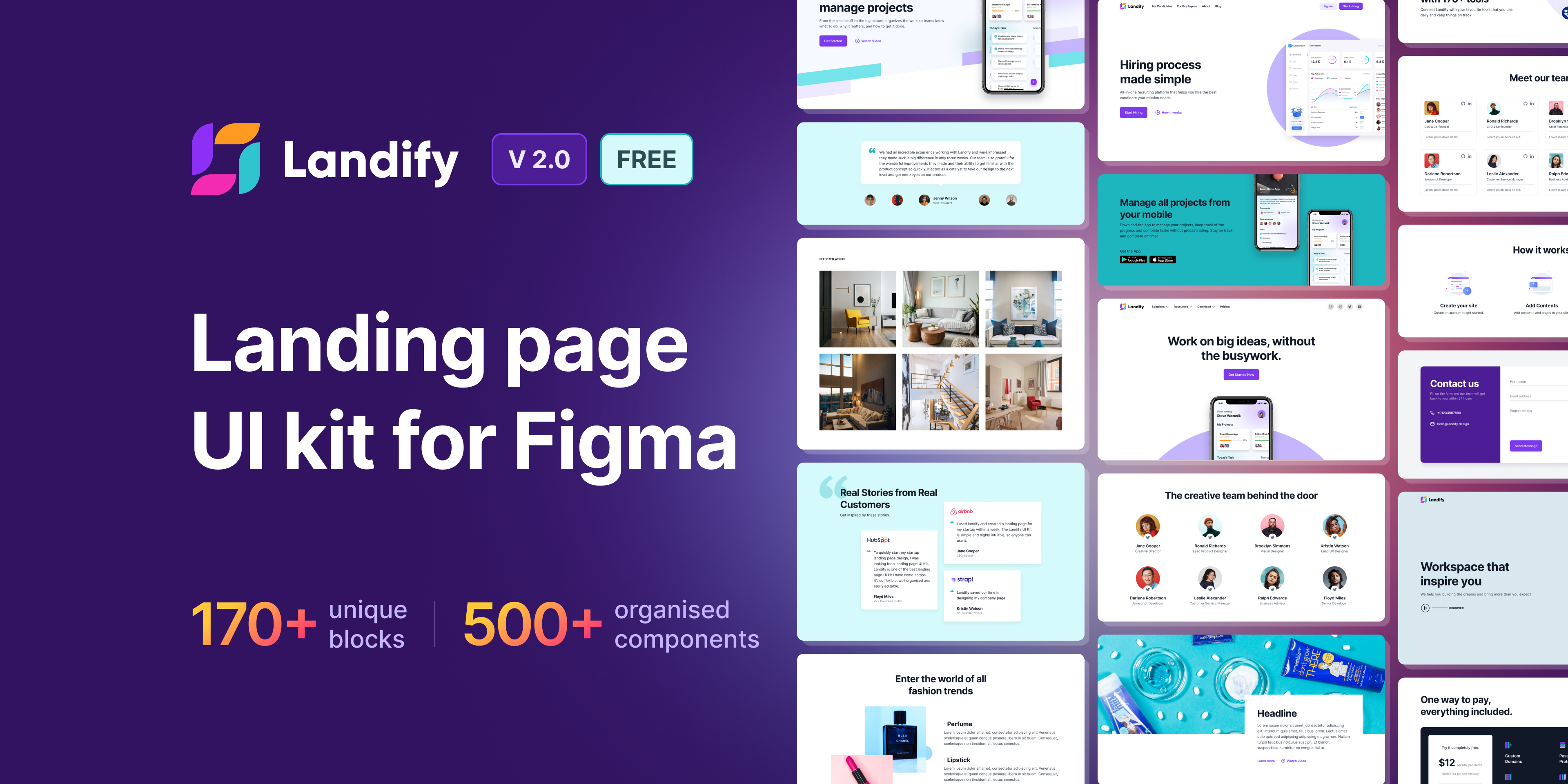
Landify is a UI kit targeted towards marketing or landing pages with over 170+ ‘blocks’, 500+ components, icons, colour styles, etc. It not only helps you build landing pages in no time, but it also helps you make your designs responsive as it has tablet and mobile breakpoints too, which most UI kits tend to skip.
🔗 Their Website | The Kit | Components File
This kit is a great foundation to use for larger design systems. They have all the basic components you may need as building blocks for any given website’s page. Their demo on figma is insightful in letting us know what value this kit could provide.

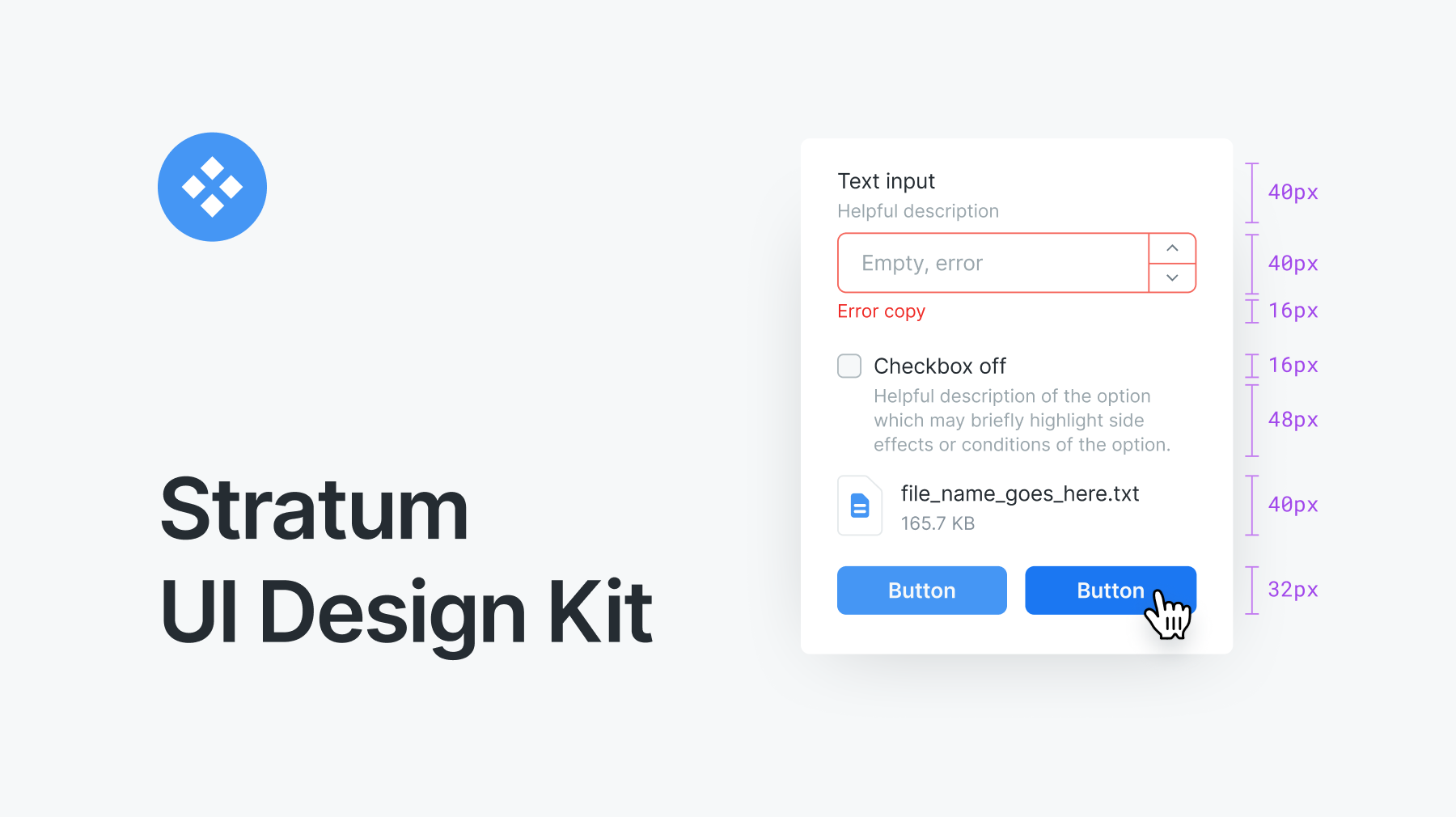
Stratum is a well built UI kit with over 9,000+ consistent components, their variants, typography and colour types, icons and even blocks of page sections to put together for a neat, modern user interface. Their kit can be previewed directly from their website.
With a focus on keeping things neat, simple, consistent and quick, they follow all the Figma best practices and have everything you might need for your project. They have responsive components and consistent spacing based on a 4 px grid.
You can preview their kit on their website and their team recently update the kit while also drastically reducing their prices. It’s definitely a deal worth grabbing!
🔗 Their Website | Figma Preview
The Design Encyclopedia is a huge UI kit. It includes hundreds of reusable UI components, color styles, icons, and page templates, with a particular focus on charts. It’s definitely helpful, consistent and in general, ticks all the boxes for bring a good UI kit.
🔗 UI Kit
BetaCRM is a high quality UI kit made for dashboards and CRM Figma Templates. It makes a wonderful base for a mobile UI kit as well. They have 200+ components, 99 desktop pages and 86 mobile screens.

Unlike the many low-quality wireframe kits you may find on the internet, Karma is a Wireframe kit (in addition to being a regular UI kit) with 900+ blocks to quickly assemble low-fidelity ideas and convey them to clients and other stakeholders. Wireframing is an important part of your design process , it helps you quickly convey your ideas without being bogged down by the finer details. Karma does an amazing job to help you with that.
They are also a remarkable UI kit with colour and typography styles, icons and components and blocks that use Figma best practices.
In today’s world, it is hard to find a UI kit that’s free and of good quality, but Nucleus is a real gift to us all. It is a completely free UI component library and UI kit that provides you the building blocks you need to design mobile apps. It follows the iOS Human Interface Guidelines. It has over 300+ components with variants in 50+ categories and over 30 screen examples.

Final Thoughts
UI kits save your time and effort. They help maintain consistency and speed your design process up. While selecting a UI kit, make a list of the things you expect from the kit, and then look for kits that suit your needs accordingly.
You could also use these kits as inspiration and create you own based on your requirements. You could use this kit and add to it as you go along the way!
If you’d like to discuss more about figma, UI kits and need help with a design project, book a call with us or reach out via email.